Lens-Artists Challenge – Complementary Colours

Egidio works with colours this week – please visit his colourful site for more inspiration!

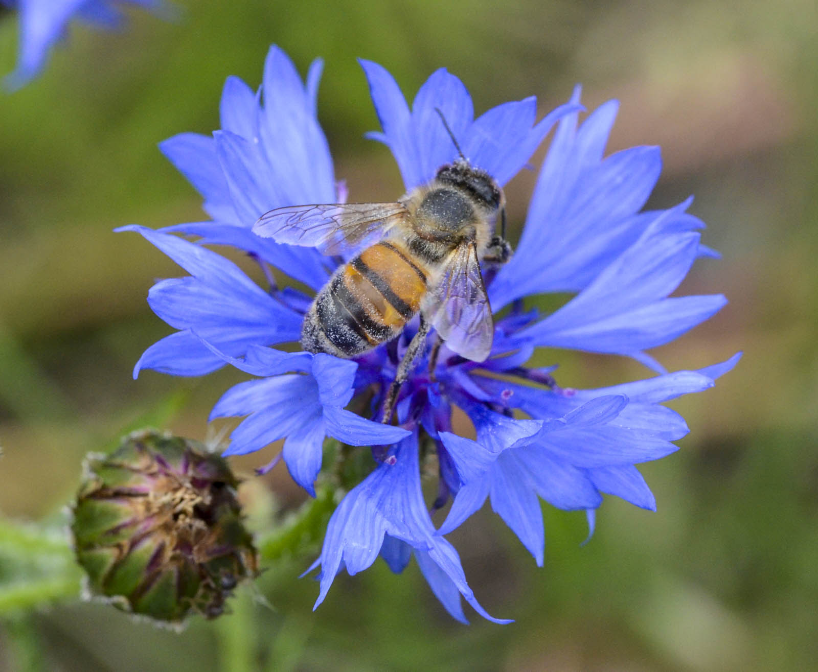
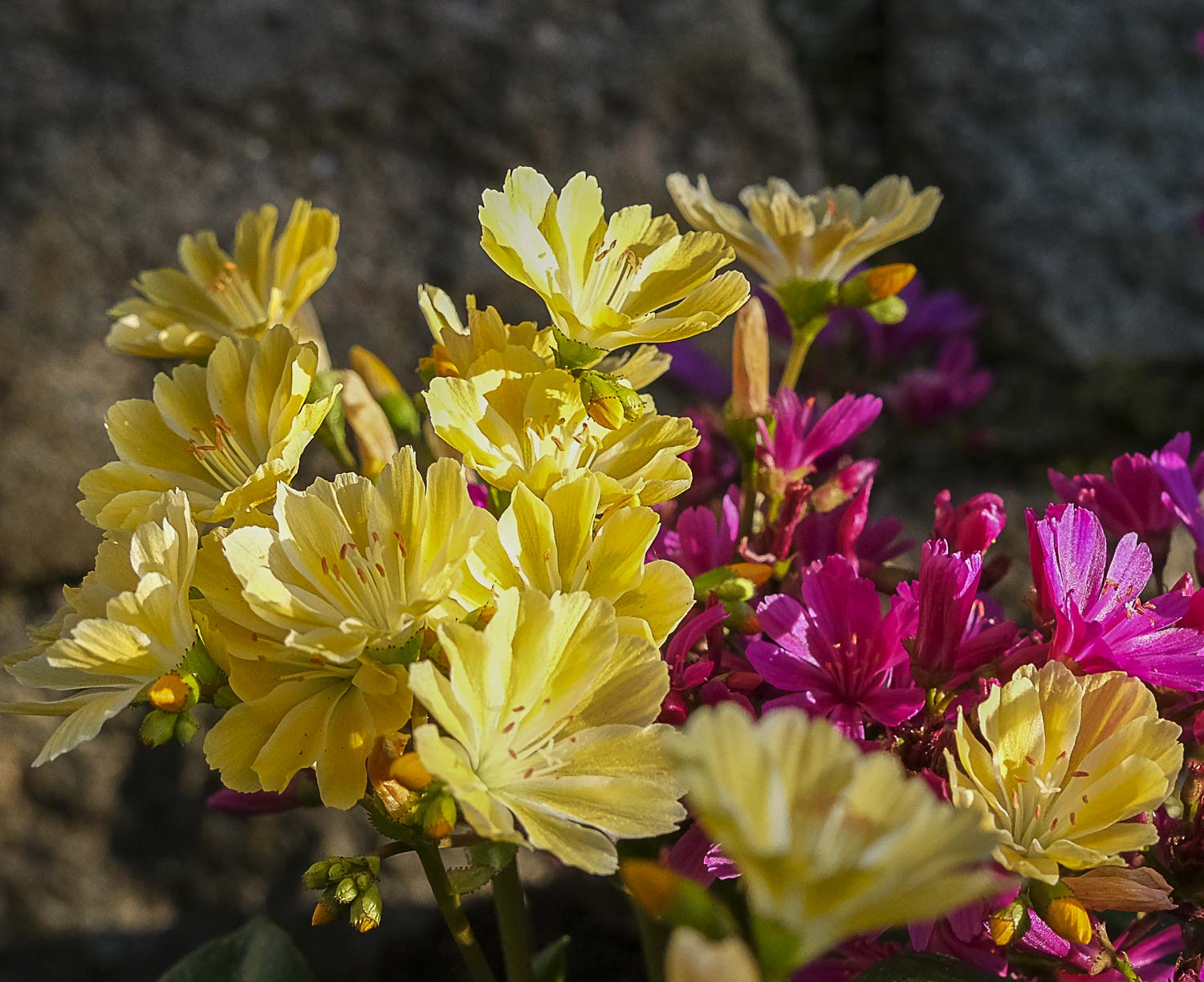
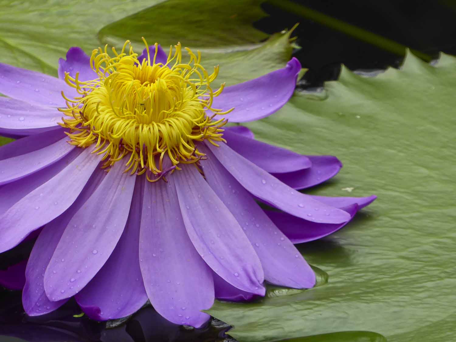
Complementary colors are those that sit opposite each other on the colour wheel. Using them in your photography or painting creates the best colour contrast, and your images will pop. For example, red and green, magenta and green, yellow and violet, orange and blue, and so on. And just like the color wheel transitions from one shade to another, you can use nearly opposite colors to make your images stand out. Naturally, the best results will be with the exact opposites.

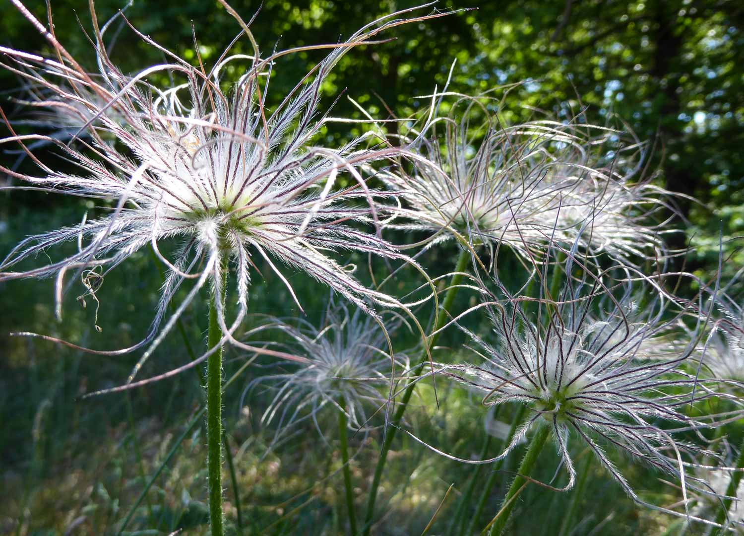
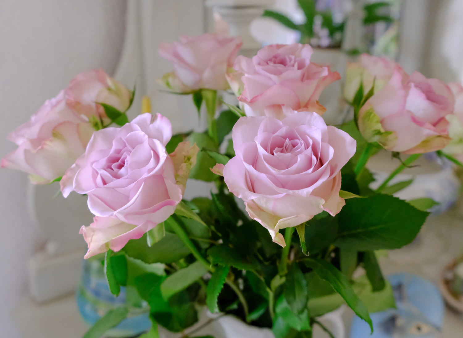
Soft colours pop in their own soft way…

– and strong colours don’t need any further presentation. Then there is red and green, where red is THE chosen colour of Swedish old houses, farms and cottages –

– naturally with a different hue and intensity than in flowers. Green is not the most natural combination with red in our houses though, it is white.

Do you have favourite combos? I guess I have yellow and violet – especially as we can find those two in one single flower – melampyrum nemorosum – the Night and Day flower. When I saw her for the first time, in 1973, it was immediate love. Surely a Swedish, modest wild flower could not look like that? Ever since then she holds an honourable place in my Midsummer bouquet.

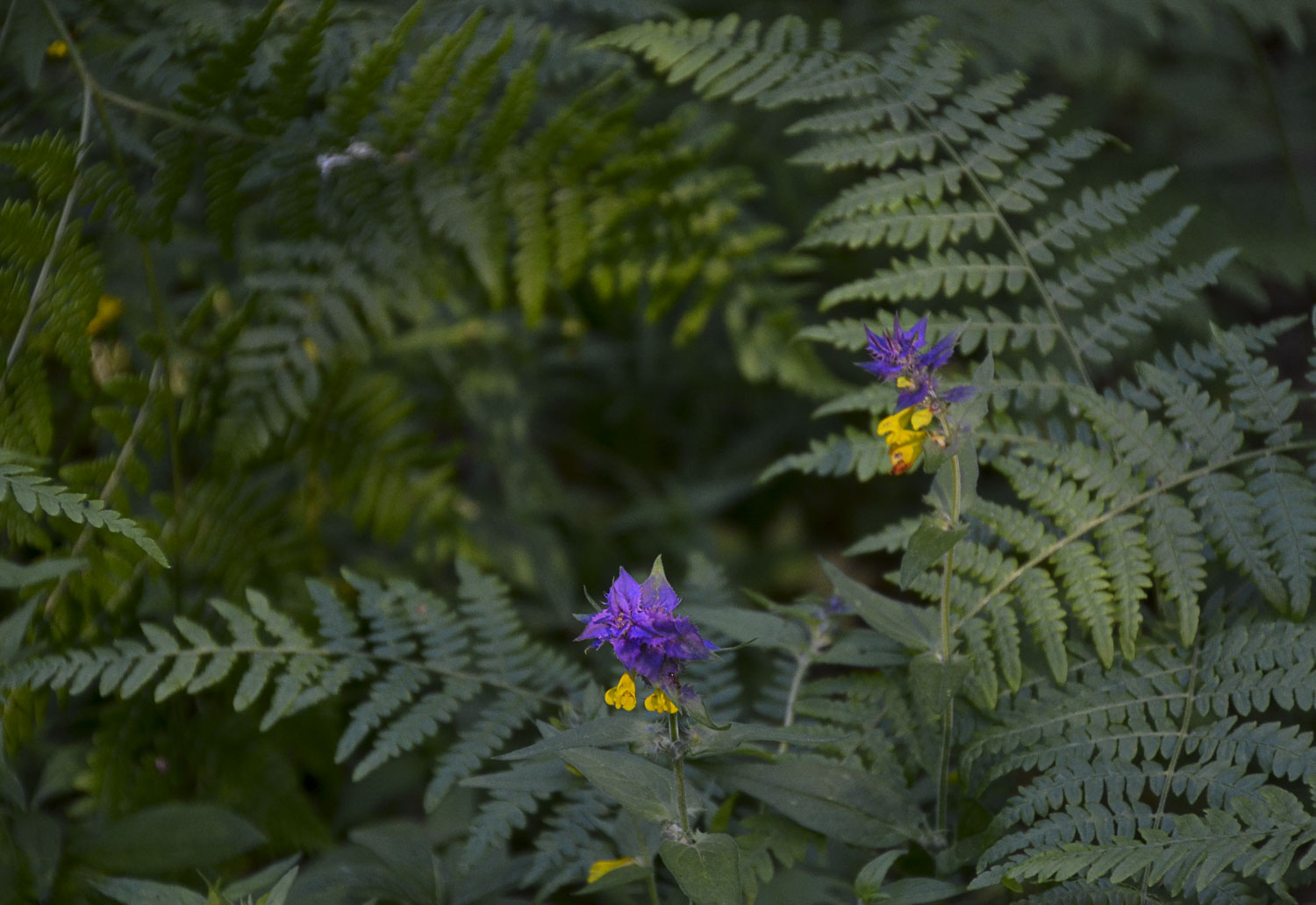
She often stands in the forest, in shadowy places but close to the sea. So I cannot find her in my own forest, only close to our summer house. A truly shy beauty.

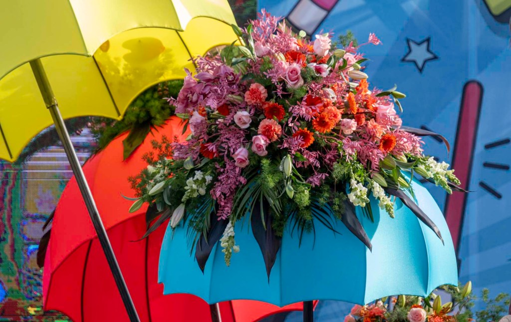
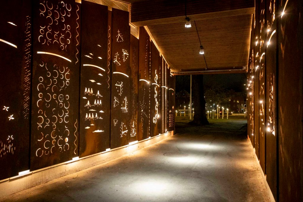
These colours look great in abstracts as well as in carnival outfits. They simply cry out: SEE ME, here I am!

Walking home late, the sky above this beautiful boardwalk in Nice kept flashing its carnival colours hroughout the night.

Finally, I guess you know I love poppies! Meconopsis betonicifolia – the blue mountain poppy – is an old love of mine…but, I don’t have it in my own garden as I don’t think I will manage it. It is very expensive and fragile, so I would hate to see it die.

Last week, Ritva got us to shoot from above. I enjoyed it very much – just as I believe you did. There were so many interesting posts!

This week, Egidio asks us to share images with complementary colors that create interest and make your photos stand out. Don’t forget to use the “lens-artists” hashtag when creating your post so we can easily find it in the Reader. Looking forward to seeing you here!

Next week, Tina returns with her first new challenge for the year. It will go live at noon EST in the USA. Tune in to find out another exciting challenge. Please see this page to learn more about the Lens-Artists Challenge and its history.

Thursday Thoughts – Swedish Match

Robert Boyle invented the first match in the 17th Century. In 1844 Johan and Carl Lundström started their famous factory in Jönköping, and at the World Fair in 1855 they won high praise and medals for this useful invention.

We took a couple of days in December to visit the old factory area, and this is the entrance where you can see some giant matches lit near the main road.

The matches are made from aspen trees, and from one tree only you can get about 370000 matches. Why aspen? Aspen is porous and yet sustainable, has no resin and burns with a clear, even flame.

We saw all the machines used and a gallery on how bad the phosphorous was to the workers the first few years before the safety match was created by Gustaf Erik Pasch in 1844. People were poisoned and some even died.

On display were also many of the beautiful covers made for the match boxes. I remember some of them from my childhood, but mostly of course the sun – match – boy. My favourite is the Tiger – hanging on the wall too. Unfortunately the designers´ and artists´ names (from many countries) were lost over time, and only one of them was truly recognised – Einar Nerman, who made the little boy in the first gallery far left. That boy was his own son, Tom, portrayed in 1936.

We had a great day of nostalgia and a lovely fish and chips dinner at a renowned restaurant.

Lens-Artists Challenge # – Shoot from Above

This week Ritva invites us to a very interesting challenge – Shoot from Above. Not my ordinary way of shooting, but certainly outside the box!

My first thought for a fitting image was a photo taken in a restaurant in Amsterdam, where the restrooms were in the cellar. On my way down I could not avoid noticing the unusual tiling. Rather spectacular… to my eyes at least!

Then a gallery from my garden and glass house. The shells are from New Zealand, then you find what is left of my favourite flower pot, one of last summer’s flower bowls, and one rusty, decorative ball. Lastly a collection of my daughter’s tinfoil balls ( I get one now and then…) in a glass box.

I love these flowers – or their foliage. The swirling shapes look their best from above. And in the header/opener is a collection of Legotechnic figures put in a box by my granddaughter.

Resilience was last week’s theme and your posts to Anne’s wonderful challenge really showed its importance in our lives. A massive thank you to you all. This week, Ritva presents us with this incredibly interesting theme, and I enjoyed seeing things from above again, although that is not an ordinary winter game. Ritva’s post is beautiful, and it will inspire you to join in. Remember to link back to her original post and to tag Lens-Artists.

Next week it is Egídio’s turn to lead so please make sure to visit his colourful site Saturday 25th January to find out more. Until then, be good and take care.