John is our host this week, and he wants us to concentrate on Cool Colours. Please visit his inspirational site for more about the challenge!
Cool colors have shorter wavelengths than warm colors (red, orange, yellow) and Merriam-Webster’s online dictionary defines ”cool” in seven ways. For this challenge, John has concentrated on hues in the range violet through blue to green, and I decided to stay with those hues too.

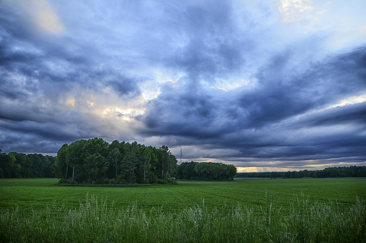
Going through my archives, I found an all time favourite image that has it all – cool colours from violet through blue and green. It is photographed in Lofoten, Norway. A magical place on this planet that has it all, in every respect.

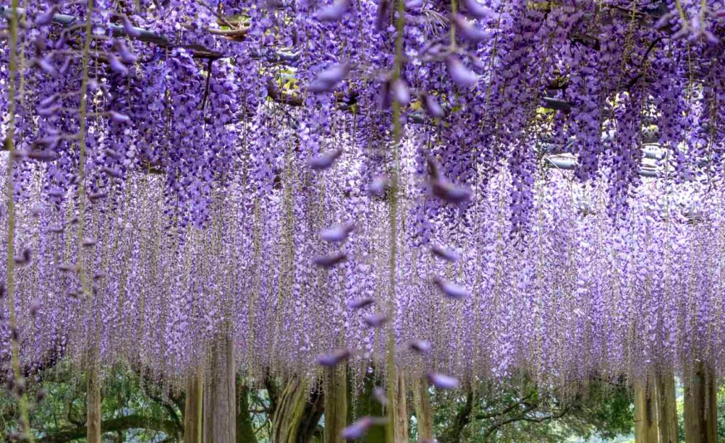
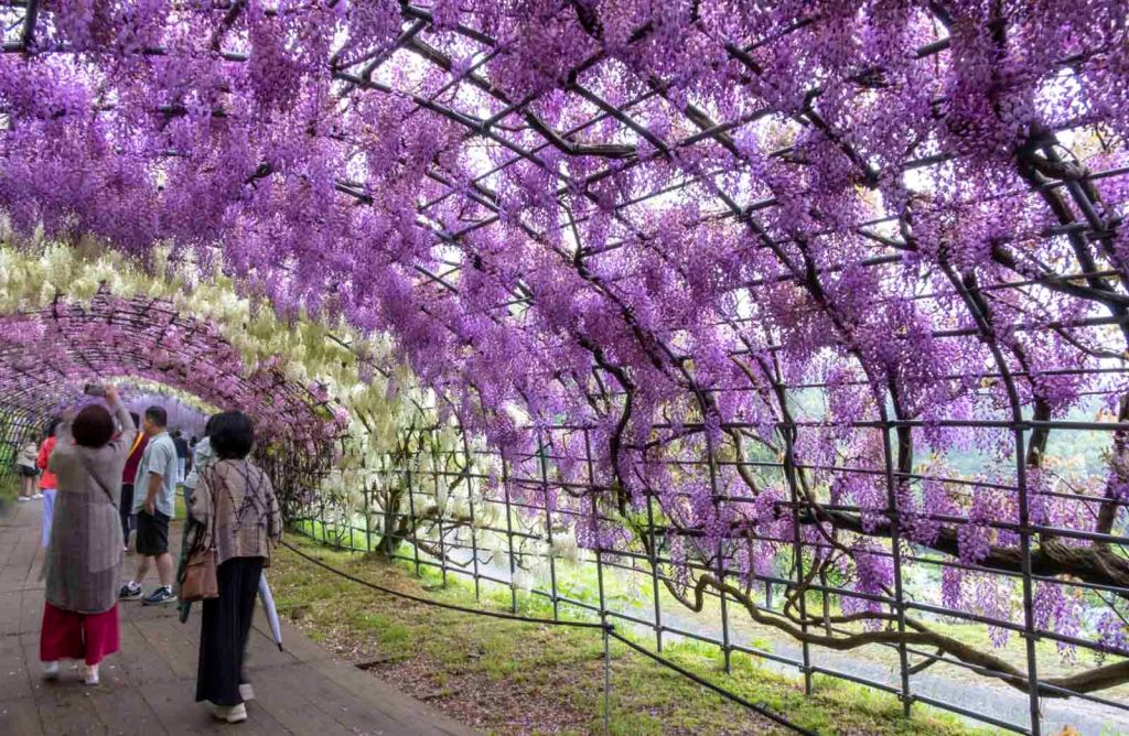
A violet evening in Nice is indeed a soft and velvety dream. A gallery from Japan and the Wistera bloom in April adds to the fact that violet is named after the flower with the same name.
Violet is considered a creative colour and associated with energies and mindfulness, it represents the future, imagination and dreams. It is also one of my favourite colours.


Blue usually stands for serenity, stability, inspiration and wisdom – a calming colour. Personally, I never wear blue – except for jeans. But I love it in nature – the sky and the sea. Especially in summer mornings and late evenings.

I often walk along the sea at our summer house – and this was a magical night in June some years ago. A warm breeze and slow waves aganst the shore.
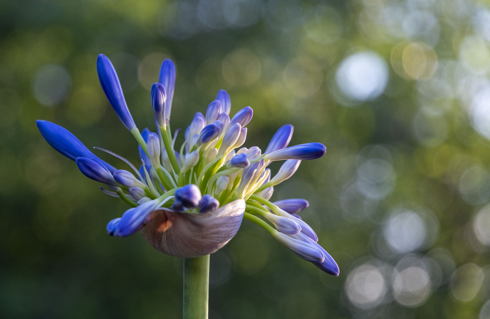
Of course we must have some flowers too – and this Agapanthus is from my own garden. Blue and green in the setting sun made the flower glow a bit warmer, leaning towards the last rays.
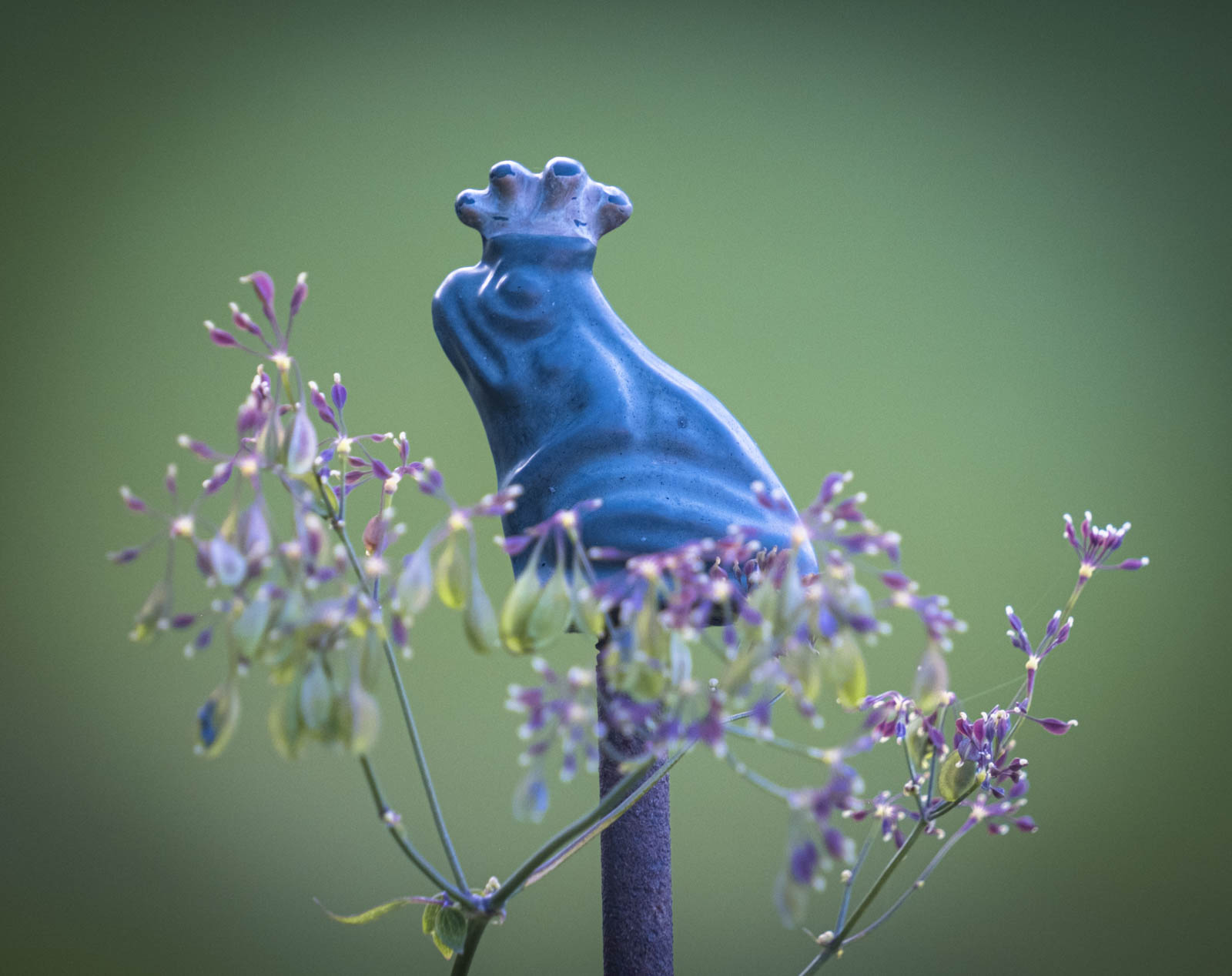
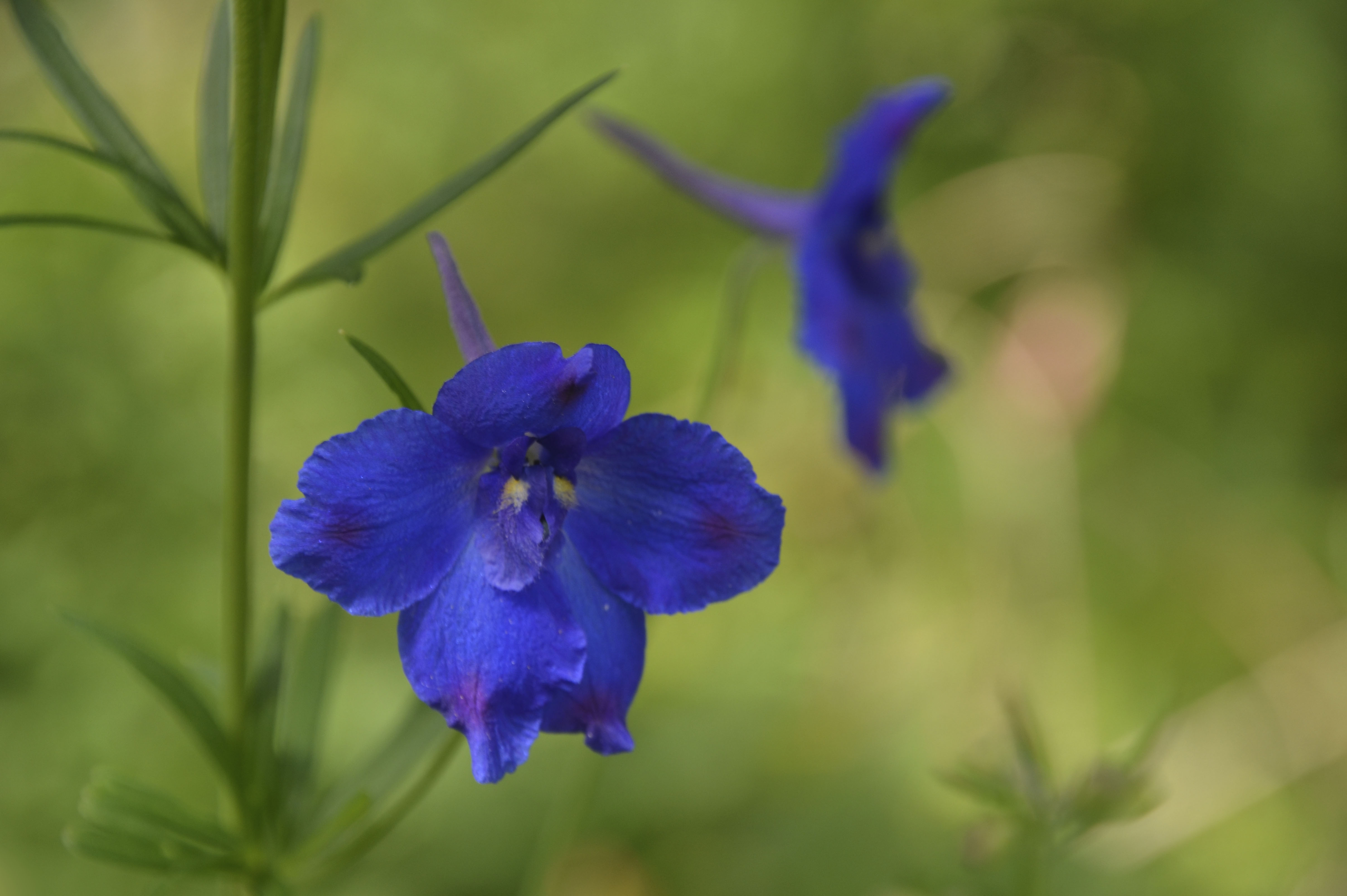
Finally, peeping over my neighbours fence, I see the blue King Frog sitting in his violet flower parasol, enveloped in a green cloak. Now we have all the cool colours in one single picture again.
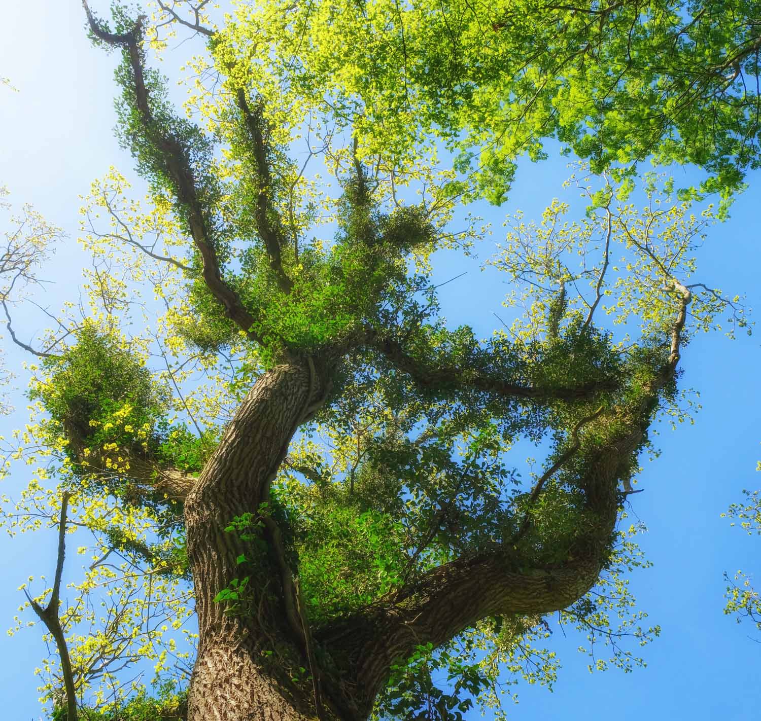
Green was my last colour, and a favourite one as well. It represents growth, harmony, fertility and freshness. It is restful and relaxing to the eye – cool – due to its spectral wavelength. I sleep in a green bedroom because of this – and it works well.
A big thank you to Sofia, for hosting last week’s Sense of Scale – an interesting and eye opening challenge. So many great examples that never had crossed my mind! Next week, Anne will be our host. Be sure to follow her here so you don’t miss out on it.
Want to join in and don’t know how? Here are the details.


Du måste vara inloggad för att kunna skicka en kommentar.