There is nothing permanent except change
Heraclitus
This week Amy is hosting our challenge, and she lets us all have the opportunity to change the world…or the world in photos at least!
As summer is changing into autumn, so the colours here in Sweden change our perception of nature. I love autumn for its earthy scent and for its colours – only lasting for a few days, but what beautiful days!
My walks in the foggy mornings at Hammarmölledamm (a pond in our forest) this week, showed the area in a new mood every day. Fog and mist too are great changers.
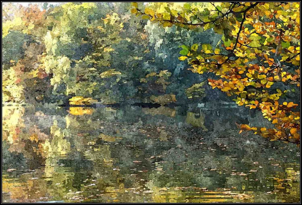
Changing the original picture into something like a painting is easily done with different software, and great fun. Here is a water colour…

…and here is an abstract version. For both pictures I have used FotoSketcher. Which one do you like most? And how much does the framing mean to the picture – and to you?
Thank you, Amy, for the opportunity to Change!

Pingback: Lens-Artist-Photo-Changeable – WoollyMuses
Wow, beautiful alternatives, Ann-Christine.
Glad you like them!
Hi, Ann-Christine. I’m catching up on the posts today after several days of traveling! I love all 3 images, to tell you the truth. The realistic and the more abstract. 🙂
I know you are a busy woman, Patti! Thank you, and then we feel the same about the images.
💟💟😊😊
A great take on changing the changeable!
Thank you so much – I had fun!
These are both very nice. For me personally, I prefer the first one.
Thank you, Amy – many do I have noticed!
Hi Leya, I realize that I have become the minority opinion. This is beautiful (no that is not the minority opinion) but prefer the photos without software which changes it into ”something else”. But that’s just me
And ”just me” I think applies to many of us. I love most art, and to me photography is no exception. I love to make ”something else” out of a photo! There is beauty in most art as there is in nature. I think I appreciate them all for what each and every one of them speak to me.
Pingback: ~281 – 287 Of 365~ – ……….365 Days………..
Love both, Leya. I don’t mind framing if it doesn’t distract from the main image.
Thank you for commenting, Mabel! I am glad you mention the frames, because that was one of the issues I wanted to know what you all felt about. A frame can enhance the artwork but also destroy it. Generally I believe photos should have discreet frames – or none. But paintings can ”lift” because of the frame.
I also think frames should be discrete… It reminds me: one of the apartments I rented a while back had a large Van Gogh painting (Starry Night Over the Rhone, probably a replica) on the wall and it was framed with a thick heavy gold frame. Somehow the frame worked with the painting. For some reason, I’m not a huge fan of putting photos in photoframes around the house.
I’m with you there. No photos in my walls – only paintings.jag
Beautiful Autumn Colours Ann-Christine and I especially love the watercolour effect – it makes the leaves in the foreground sparkle 🙂💖🍂🍁
Thank you – I love water colours too!
(EN) Love both pictures and the artistic change. Every time something ”magical” from you. Thanks for sharing
(IT) Mi piacciono molto entrambe le immagini e il cambiamento artistico. Ogni volta qualcosa di ”magico” da te. Grazie per la condivisione
Thank you for a lovely comment – I will keep it close in my heart.
Ann-Christine. It is lovely of what you’ve done with your photo. I would hang it on my wall also!
Haha, well – thank you for the compliment!
You’re welcome, Anne-Christine!
so beautiful, both the photo and the edits. The watercolor looks so real ♥
Thank you, Mona, so glad you liked it – water colours are my favorites. The softness and blurriness is calming.
it is 🙂
I would hang these on my walls any day and loose myself in their beauty!
♥
Ann-Christine, such a beautiful watercolor landscape showing remarkable colors!! Believe the picture without the frame draws my attention to the details and colors more. A great picture!!
So glad you enjoyed it! I agree the frameless one enhances the details more.
so lovely Leya!
Thanks!
I’m a person who generally doesn’t like software effects but I like your second photo. Am I right that this is the one that has a water colour effect using software? It looks brighter and has a very nice water reflection. Its my favourite and I admire what you’ve achieved.
Thank you kindly – now, I love water colours and paint some myself (not very good at it…), so that one is my favorite too!
Stunning pictures and colors!!!
Thank you so much!
Lovely interpretation.
Thank you!
Well captured, Ann-Christine! Love the result of the change. 🙂
Thank you, Amy – a real fun challenge!
How fun Ann-Christine! Love the frame, it really makes the photo look like art!
I have fun using software…but as you say, it might be time consuming…