Tina challenges us this week to think Harmony – and in her splendid post, she encourages us to show our favorite harmonies. In short, Colour Harmonies are colors that look good together. If you have ever taken classes in painting, you should be familiar with the colour wheel. There are many different systems to create a color harmony. You will find a useful, free tool, for colour harmony here.
I guess colours are always a part of what makes up our inner concept of ”Harmony”, but there are also other types of harmonies. These are some of my favorites.
Art is a harmony parallel with nature – Paul Cezanne
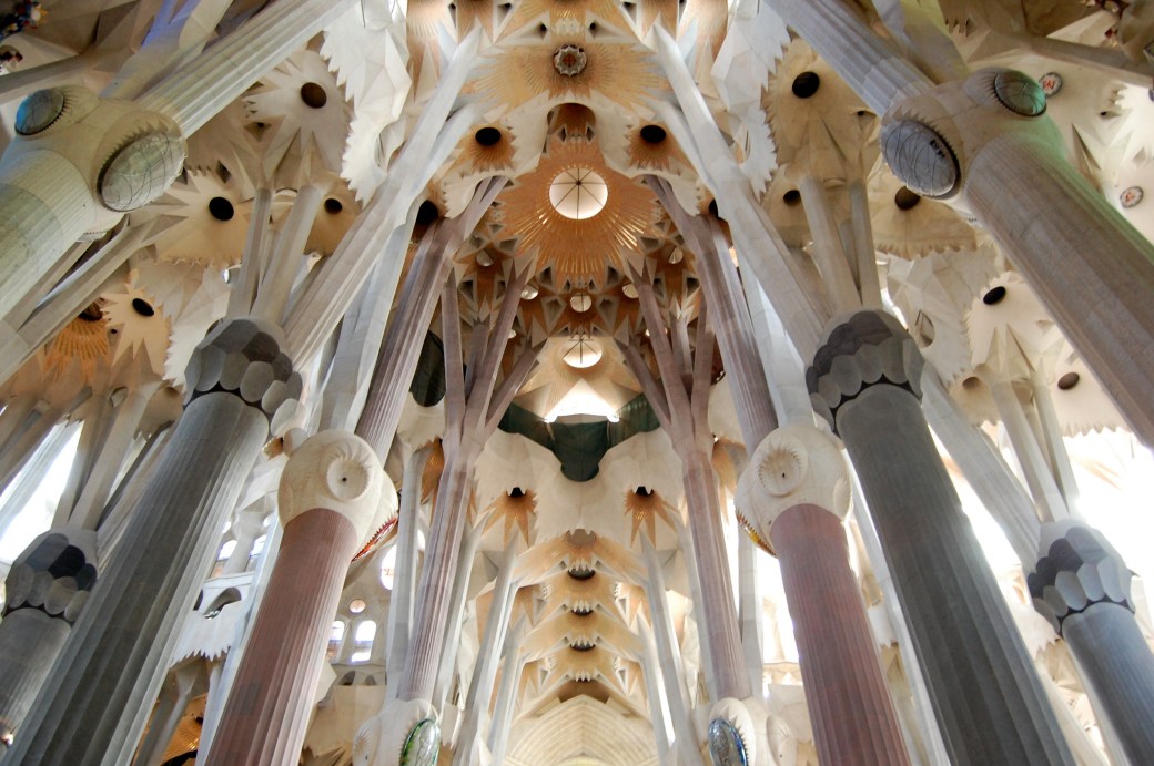
Antoni Gaudí’s masterpiece Sagrada Família.
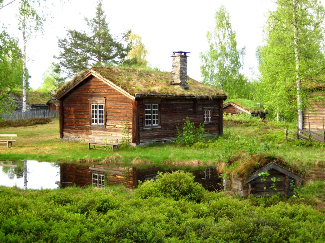
Organic architecture is a philosophy of architecture which promotes harmony between human habitation and the natural world. The term ”organic architecture” was coined by Frank Lloyd Wright (1867–1959), and Wright’s ”Fallingwater” is a very good example – but the concept can also be illustrated with an old Nordic cottage like this one.
He who lives in harmony with himself lives in harmony with the Universe
– Marcus Aurelius


A life in harmony with nature, the love of truth and virtue, will purge the eyes to understanding her text – Ralph Waldo Emerson
Happiness is when what you think, what you say, and what you do are in harmony – Mahatma Gandhi
Harmony is pure love, for love is a concerto ~ Lope de Vega
Even if some will always be playing out of tune…

…it still is a Concerto.

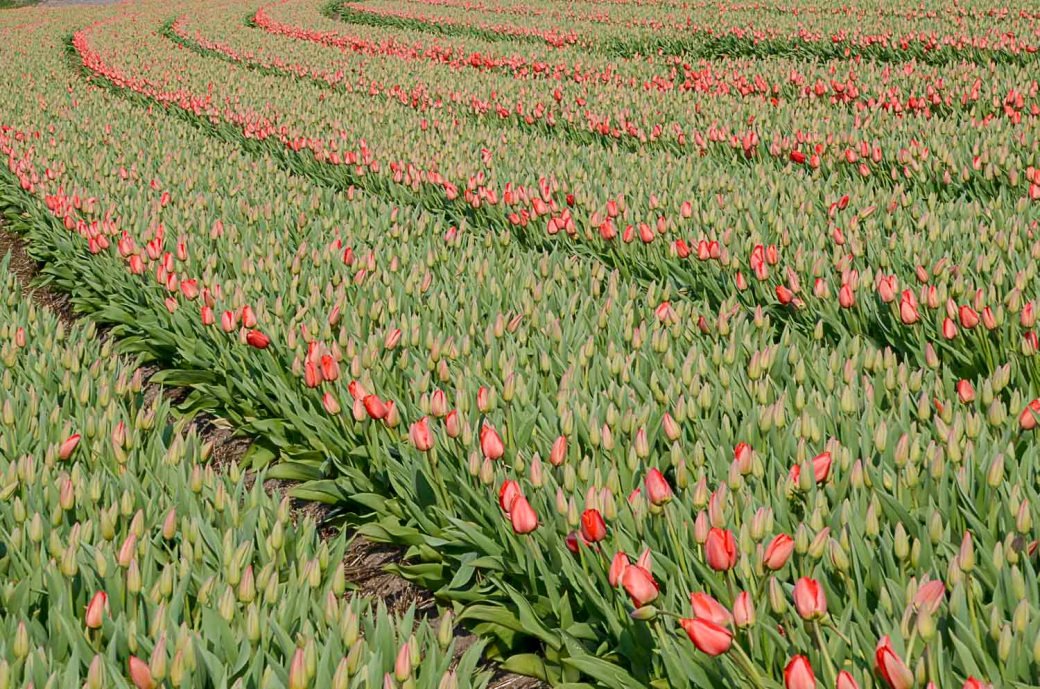
With love from the vast tulip fields in The Netherlands.
So, How do you reach colour harmony in your picture if it isn’t there from the start?
A simple and effective way to change its mood is to shift the white balance either towards the warmer or colder temperatures. This can often also push the image towards a colour harmony. One of the simplest yet also most effective ways to further tune your colour harmony is to use the Hue, Saturation, and Luminosity (HSL) panel in Lightroom.
Or, if you were a certain fashion icon: Women think of all colors except the absence of color. I have said that black has it all. White too. Their beauty is absolute. It is the perfect harmony.
―
Thank you to Amy for last week’s lovely ”Less is More” and we’d love you to join in with Tina’s ”Harmony”!

Such a remarkable set of photos for harmony, AC! Thank you for the helpful instruction. 🙂 🙏
Glad to share them, Amy!
Faboulous Photos great work
https://pubgtipsandtricks2019.blogspot.com/
Gandhi has it! If only I could stay in step 🙂 🙂 Beautiful thoughts and images, Ann-Christine.
Glad you enjoyed them Jo!
I love your fabulous photos, Anne-Christine. But my favorite is the Nordic cottage. It looks so peaceful there.
Glad you do! And I can assure you it is peaceful there.
Love the camels.
😁
Beautiful, beautiful images. 🙂
Thank you, Su.
Gorgeous photos, A-C, and I enjoyed the quotes and your thoughts as well. I don’t have Lightroom, but I can play around a bit with some other editing apps. I must admit, thought, that when I see many of the photos at shows, I can tell that the colors have been saturated a/o adjust so much and I know that what they shot didn’t look like that at all. I’m not saying you did that, but I see lots of photos done that way.
janet
That over-saturating thing is really not fun. I seldom saturate – only when the colour is not looking the way I saw it in reality. It seems people have lost the ability to appreciate subtle things – in fact I hardly look at other peoples instagram pictures anymore. The more saturated – the more likes it seems… Some are totally unnatural and weird looking. If it is on purpose for another artsy look – but mostly it is just misused.
I do the same–saturate to make the shot look the way I saw it, but that’t it unless I’m just having fun with editing and don’t expect anyone to take it as real.
I am learning lots from the harmony posts. Lovely images. Especially that Nordic cottage, it really is in harmony with nature too.
Happy to hear! I think learning from each other is the most important and lovely thing about blogging. Glad you liked the old cottage . typical for us in the northern countries.
Each image has its own sense of quiet and serenity.
Glad to share them with you!
Absolutely a wonderfully beautiful post Ann-Christine 😀😀
Thank you very much, Brian!
I enjoyed your post, Anne-Christine. The photos are fabulous!
Happy you enjoyed them, Miriam – glad to share them with you!
You’re welcome and I love them, Anne-Christine!
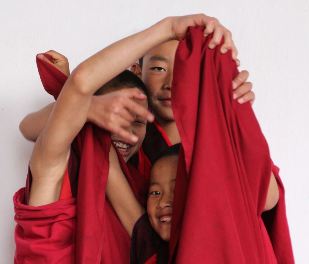
Stunningly beautiful shots, AC. Just gorgeous. I also love the little monks. I saw the Sagrada Familia years ago, so your shot gave me a glimpse of it at a more final stage. It was stunning years ago and it’s even more so now. And thanks too for the color harmony link! Wishing you a week filled with harmony, long walks with your dogs, and plenty of sunshine. 🙂
Thank you, Patti, for your praise and good wishes! I would love to visit Barcelona again to see the Sagrada Família once more – I have seen so many pictures lately and the progress is fast. We visited in 2011, so I guess we will give it a try in a couple of years from now. Hope you are all well and – traveling? What happened to that quirky festival you were going to?
Great harmonic post! Thanks for the color link 🙂
So glad you enjoyed it! Thank you!
Beautiful post.
Thank you so much! Glad it pleased you.
Lovely photos. Thanks for the link to color harmonies.
Thank you – and you are welcome, Marie!
What a nice response this is to the Harmony challenge. thank you!
So glad to share it with you!
Oh, brilliant post, AC.. I love the suggestions regarding colour harmony in post-processing, and some fab examples!
Happy you enjoyed it, Sue!
Definitely!
A beautiful post and some excellent suggestions for achieving color harmony in post processing as well. Loved your header – amazing, and your little monks are adorable. As always Mother Nature says it best in your tulip colors!
Glad you found it beautiful – and of course I had to use my tulips…