Patti sends us this week’s challenge – and it is an interesting one – because it is a choice we make many times, at least I do, when I visit Lightroom. Will this photo be good as it is in colour – or would it be better in monochrome or B&W?
Color is descriptive. Black and white is interpretive.
— Elliott Erwitt
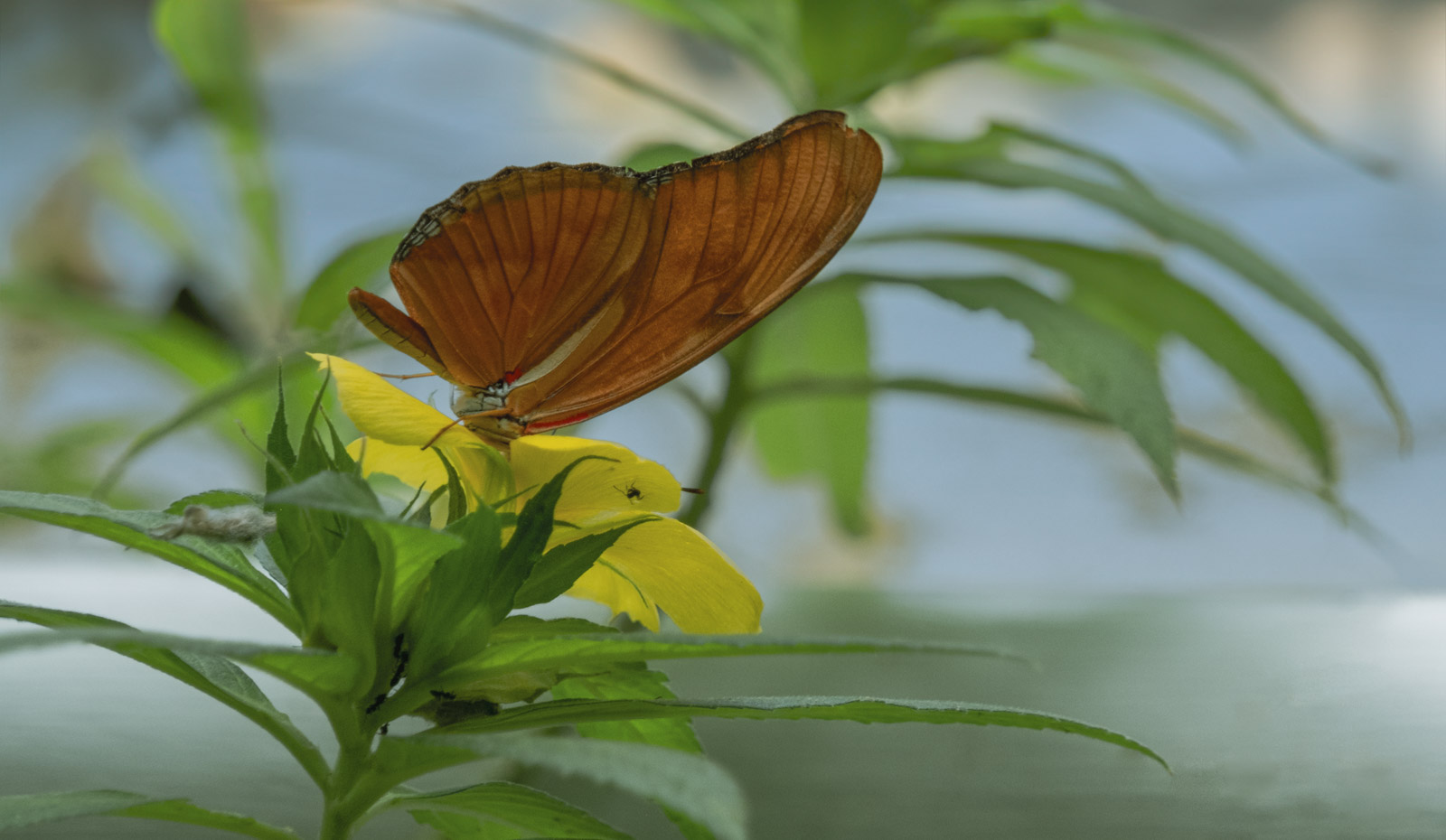
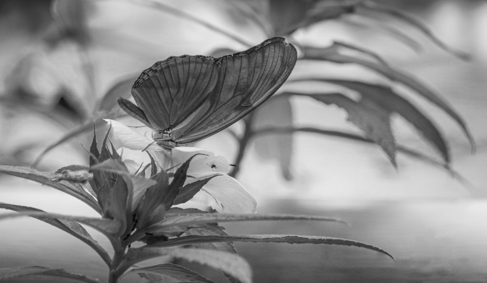
I often land in colour, as I am primarily a nature photographer. Nature is so much about colours. Some pictures though, like the butterfly above, make a lovely B&W as well. For the light and the structure it works well. Kontrasts make B&W pop, so generally I would choose B&W for portraits. I love portraits from olden times with people’s clear faces and all dressed up in their best clothes.

When you reduce life to black and white, you never see rainbows.
— Rachel Houston
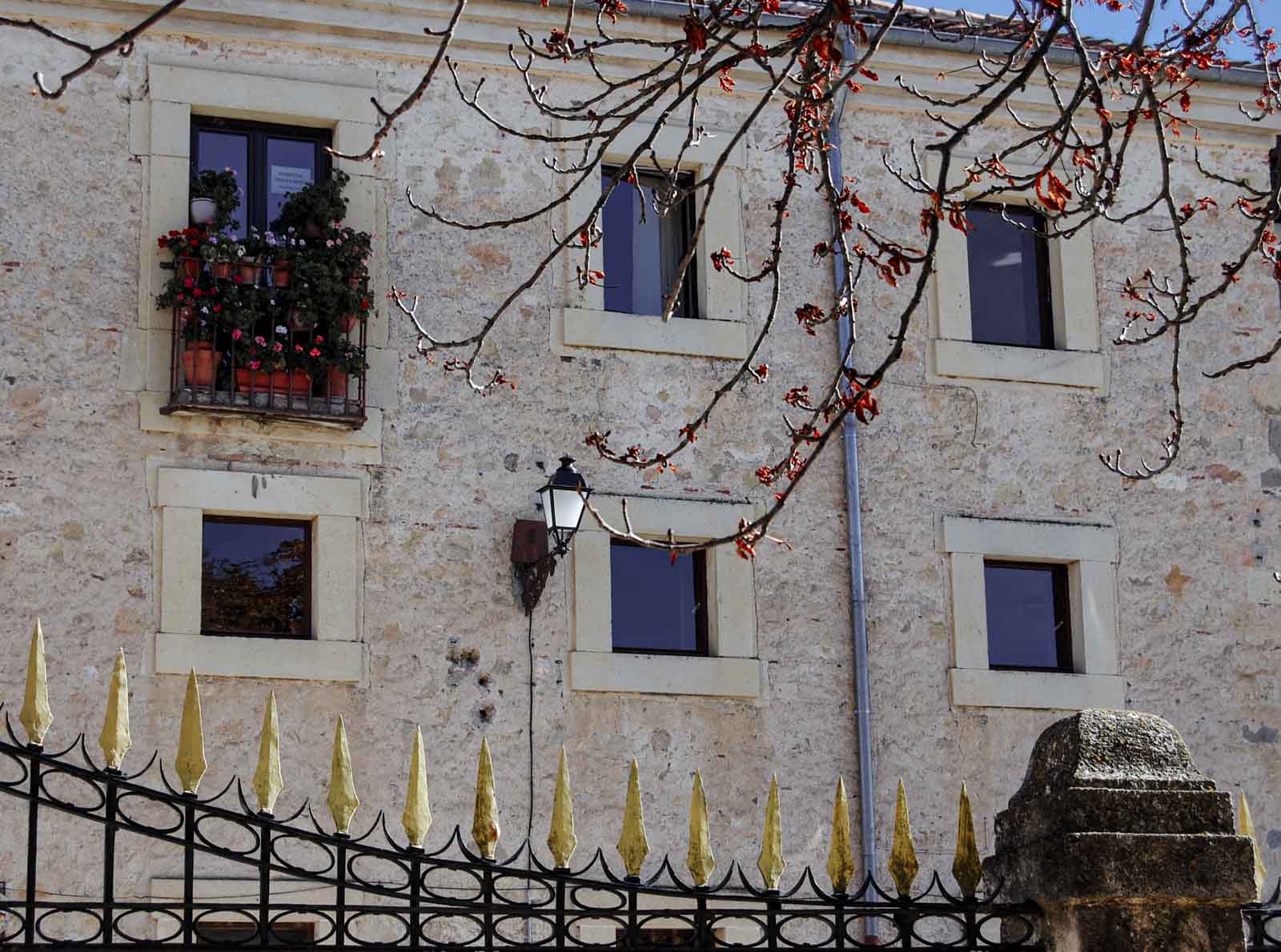
Architecture often goes well without colour because the structure, the light and shadows become more obvious and we can easier see the artist’s intention. Which one do you prefer of this house? Personally I think both work well.
The special factor about black and white photography is that it doesn’t just copy the reality, but it represents it with its own language. — Gian Marco Marano
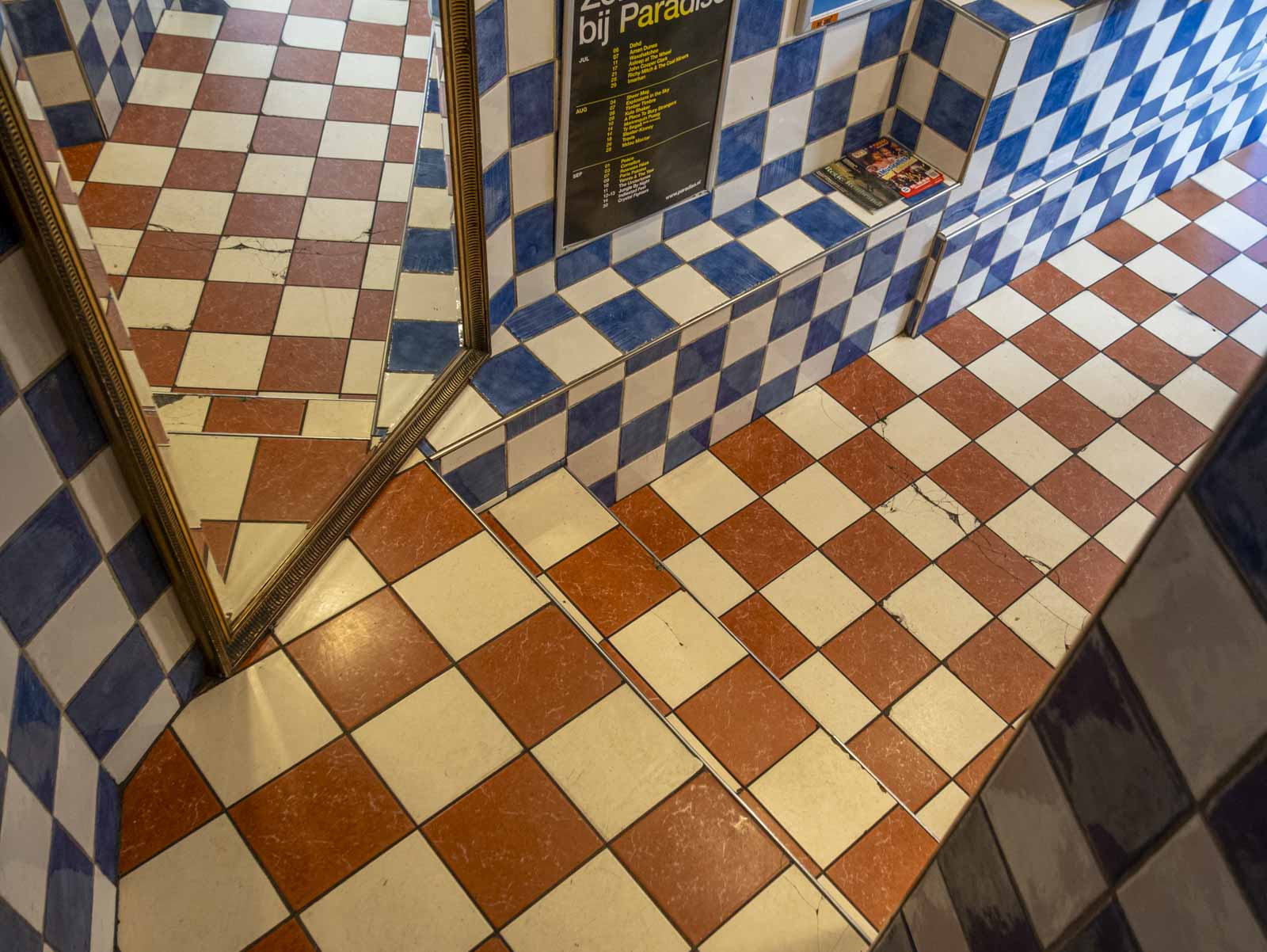
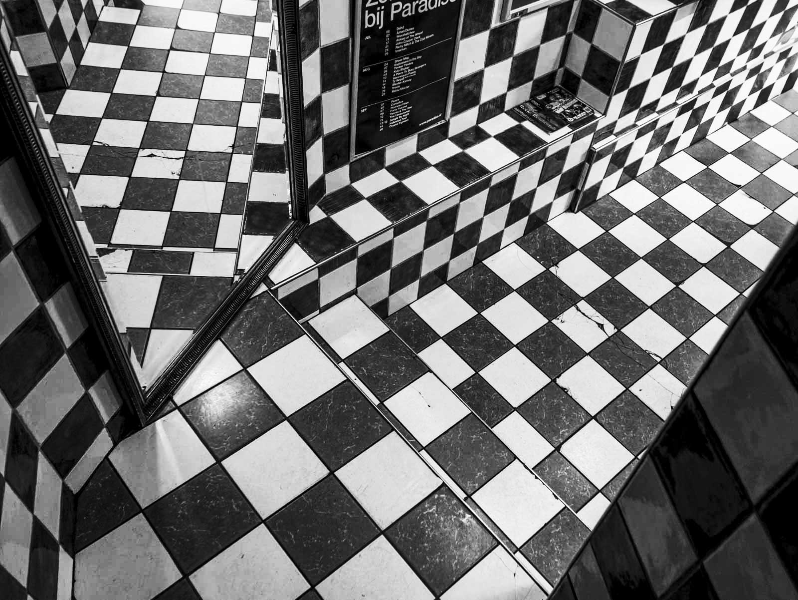
Some weeks ago I posted the colour photo of this cellar restroom from upstairs. When you turn it into B&W it suddenly looks more coherent and maybe even possible…It all depends on what you want with your photo. My intention last time was to show how ”impossible” this combination was, that’s why I chose the coloured one over the B&W.
So, when is it best to use one vs the other? This challenge gives you an opportunity to explore the difference and the impact of using color or black & white photography in your selected photos. We hope you will join us! Post pairs of the same image in both color and black & white. Limit the number of images to 3 pairs. Compare the differences in mood, texture, and light and share your thoughts on how the processing impacts each photo. Tell us which one you prefer. Be sure to visit Patti’s inspirational site and to use the lens-artists tag and leave a link on her site.
Last week Tina challenged us with her dogs and cats theme – who could resist that one? Thanks to Tina and all of you who shared your photos and stories. It is heart warming to realise how much our pets mean to us. Next Saturday it is my turn to host, so be sure to visit Leya next Saturday, February 15th at noon EST. Until then, have a peaceful, inspiring, and joyful week!

I’d have to go for color on these Ann-Christine!
♥
👍
Amazing
This is an amazing photo.
Thank you!
So, it’s a hard one this week, Ann-Christine, I’m struggling to pick 🙂 First one I’d normally prefer colour but your monochrome is so soft it’s wonderful. Second, I’d go for colour although is the kind of subject perfect for black&white. Last one, black&white wins easily, it makes is so much more intense!
Interestingly we feel the same about the house too. What does it for me is the little red splashes that really does it for that photo – and the gilded fence. Happy you liked my choices! I tried to find photos that would work either way – except for the last one…
Good explanations and examples of why and how to use B&W vs color. I like the stairway in B&W and generally prefer color unless there is a great contrast of texture, form, or lighting to highlight.
I agree – thank you!
A very interesting set of images Ann-Christine. Actually I think all of your choices work both ways. I prefer the colorful butterfly but admit the B&W version is also beautiful. I prefer the B&W version of the building but only by a tiny bit, and like both versions of the third image equally. An excellent set of choices!
Delightful
Thank you!
Ann-Christine, I love your choices for this challenge. I would have never thought to convert a butterfly on a flower to black and white but I love your black and white version.
Haha, well, I agree about the butterfly, but tried to pick one nature photo anyway. For me, nature is colour and very few are fit for B&W. Happy that this one worked! Thanks!
An interesting set of three for us to consider! I think the butterfly works surprisingly well in B&W but I’m leaning towards the colour version. The house I definitely prefer in colour because of the inclusion of the Christmas decorations and the gold railings, both of which lose their impact in B&W – but if it were a shot of the building alone I might favour B&W for the texture. Lastly, I like your tiles best in monochrome as it turns it into a set of fascinating geometric squares and angles. It reminds me a little of an Escher work!
I agree with your thoughts – and with the house, there are also lovely little splashes of red that won’t be there in B&W. Escher? Why not!
Love the rainbow quote! I must try one in black and white! I never naturally turn to black and white, but occasionally I wonder. I didn’t think your butterfly would work, but it does! Hope you’re having a great week, Ann-Christine.
Thank you, Jo – that quote is a good one. And B&W should be used only when it works well, I think. Portraits and buildings, geometric things.
Fab examples, AC.
Lovely Butterfly, in both!
♥ I love that butterfly too! Thank you!
Welcome, AC.
As I started to read your post I was convinced that with your images, I would always prefer the colour version, as you’re the Mistress of Subtle Colour. It turns our you’re the Mistress of Monochrome too, and in each case I can’t pick a favourite. I was glad to have seen both versions!
Margaret – now you had me blushing! What a lovely comment! ♥ I did try to find pictures that would work in both versions – I guess I managed that! Thank you for making my day!
😊
These are very different in different ways Ann-Christine. The first one I like in both versions. Though the second one, in colour you notice all the flowers, but in b&w you notice the stone work. Then the third, I think the colour makes sense of the scene where b&w makes it more abstract. Great images to use.
Thank you, Leanne – I tried to find photos that would work both ways. A fun challenge.
Wow Ann-Christine, these are so good. Just right to show the differences.
Thank you, Brian, I tried to find photos that would work well both ways.
Your photos show again that colour and B&W are two different things altogether. Both may be interesting, just as two people may take a photo of the same scene, emphasize different aspects, and may both be interesting.
And that is a good thing!
Your edits are excellent whether in color or B&W. If I pick favorites, though, I have to go with color for the butterfly and monochrome for the others.
We can agree on that, but somehow the tiny splashes of red in the house speak to me as well.
I like the b/w in all of these
Thank you – I tried to find photos suitable for both ways.
Pingback: Lens-Artists Challenge #338 – Colour vs Black & White - Bloggfeed
That butterfly is very adorable
Thank you –
I so concur with Terri! A case of ‘horses for courses’ – Somehow the colour is ‘needed’ in the first two of your examples, but in the toilet steps photo here is ‘reality drama’ in the b/w ! Interesting!!!
Thank you – glad you enjoyed my choices!
Pingback: Lens-Artists Challenge #338 – Colour vs Black & White - Fotofeed
Gorgeous examples for the challenge, Anne-Christine! I call myself a nature photographer too, so color usually rules for me. Your first two speak volumes in color, especially the yellow in each one. The yellow disappears in B&W. That being said, I love the geometry of the 3rd image in B&W!
Thank you, Terry! I tried to find photos that would work in both ways!