Green is the prime color of the world, and that from which its loveliness arises.
– Pedro Calderon de la Barca
Sofia challenges us with primary colours. I realise that I seldom – or never – use these colours. Not in my home, not in my clothes or presents. Not much in my paintings, but in photos!

My first associations with primary colours are grounded in their old meanings. I know there is a whole science about this, but my grandmother taught me: Red for roses and love,…

…Yellow for the sun and for Autumn to come.

Blue for the blue hour, the blue sky and sea.
A perfect combo for me would be a picture like this – in muted, soft primary colours. Because My greatest love lies in the seconday colours: orange, green and violet. A ”mixed” person? Maybe. And – who are you in colours?

In daily life, red and golden yellow is also significant for Christmas…
…and for old time fairs and celebrations.

In some countries red is the colour to get married in…
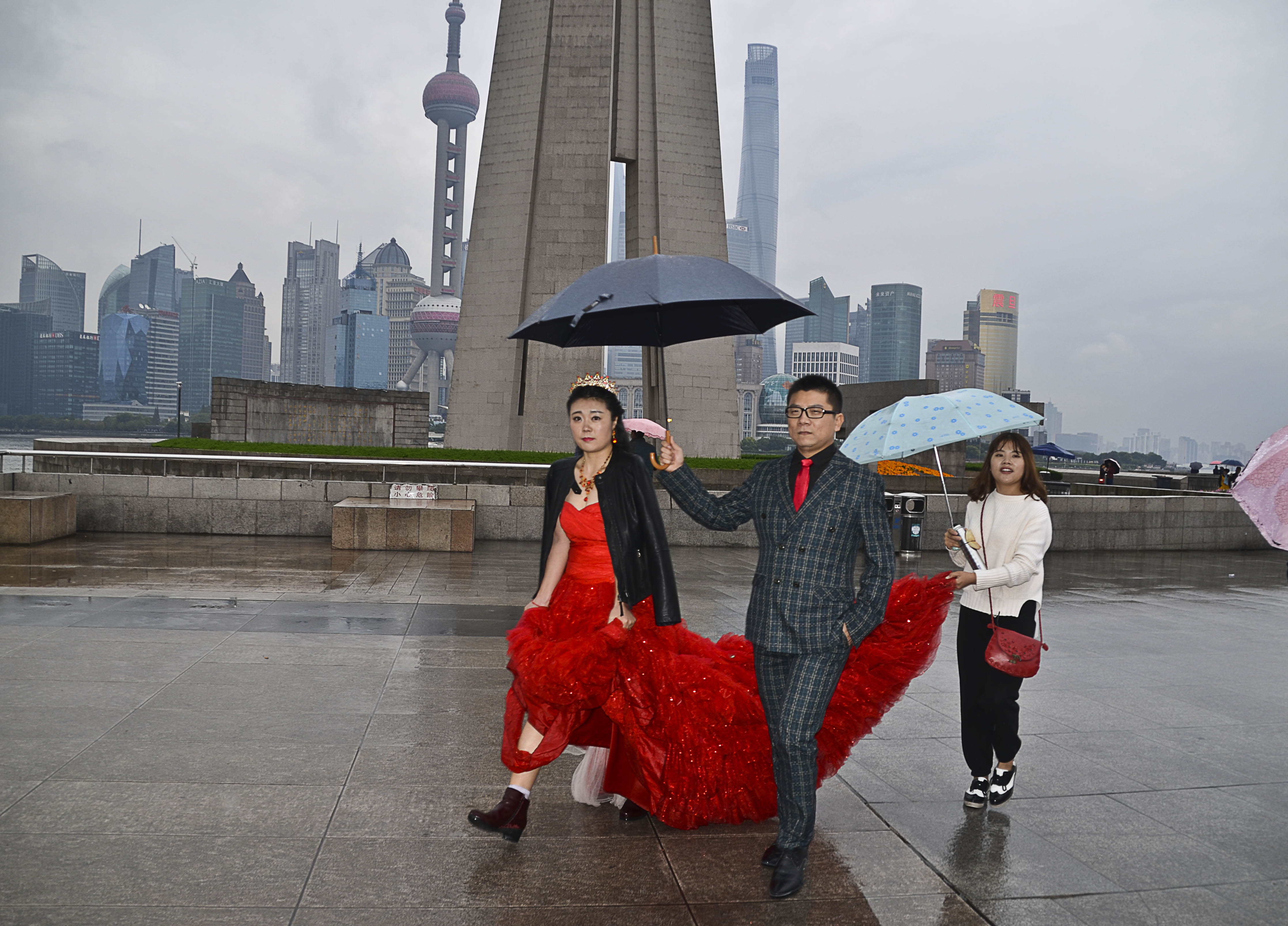
…come rain come shine.

In Prague I found this colourful and patterned couple. Not on their way to church…I think.
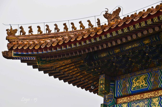
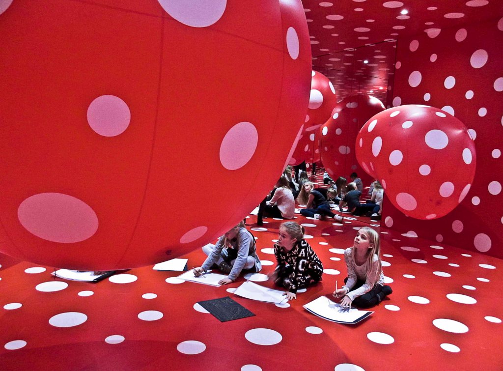

In China, yellow was only for the emperor, and still yellow, blue and red seem to be the preferably used colours in their art works. Yayoi Kusama, Japan, is an avid user of primary colours as well – but with dots.

Swedish summer means much of the colour blue – but not this year…rain and wind were the primary ”colours” for our three summer months, June, July and August.
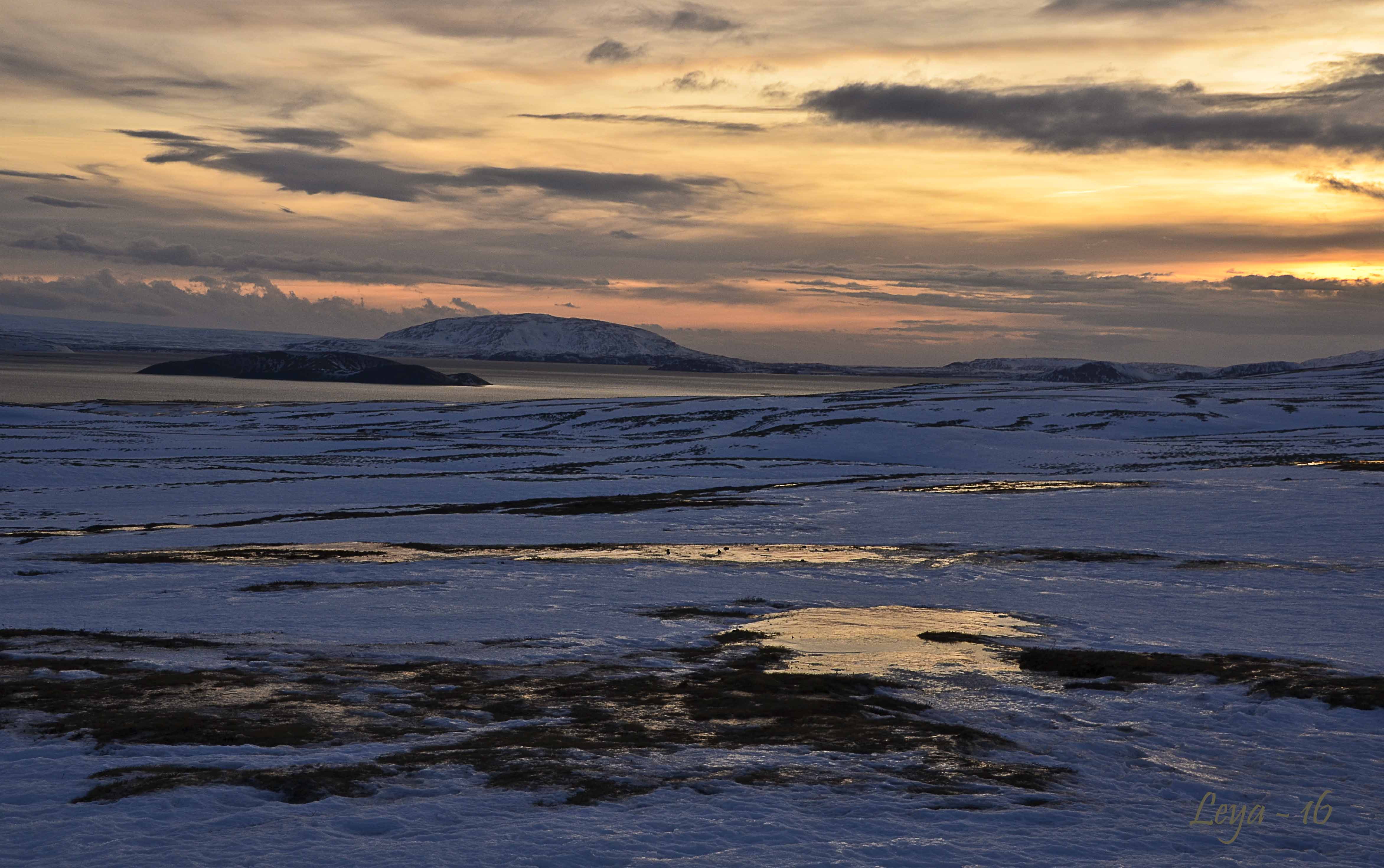
And soon, the cold, blue winter nights are awaiting.

Finally, Ukraine and Sweden have the same colours in their flags. A fact we are reminded of every day. Freedom is the difference. May it come to all of us – to stay.
This week Sofia invites us to play with primary colours. Red, Yellow, Blue. You can pick one colour or show us examples of all 3, separately or together. Looking forward to seeing your replies! Please link back to Sofias original post and tag Lens-Artists so we can easily find you.
Last week it was all about Faces in the Crowd with John’s challenge. So many fun expressions and creative approaches for this theme. Next week, Anne will be our host with Black & White and Monochrome. Please visit her lovely site and be inspired to join us, Saturday 2nd of September. Until then, be nice and take care.
If you want to know more about the Lens-Artists Challenge, please click here.

Pingback: Lens-ArtistPC-264-Primary-Colours – WoollyMuses
Fantastic examples!
Colourful indeed!
Love the blue ones!
Thank you!
Beautiful set again. I can understand your love of secondaries, given that I seem to love muddy colours: browns and shadowy leaves, cryptic insects, and so on
Well, muddy colours go well with me too. Earth colours.
I love everything about this post, Ann-Christine. A picture-perfect article about primary colours ❤️💙💛 The red bride is stunning and I’m jealous of your Yayoi Kusama’s photos. Did she exhibit in Stockholm? We once almost went to Helsinki to see her work, but couldn’t get any tickets to get us there in time.
Thank you, Dina, much appreciated to hear from you! Kusama had the exhibit in Elsinor, and I’d love to see more from her.
Pingback: Lens-ArtistPC-264-Primary-Colours – WoollyMuses
Pingback: Lens Artists #264: Primary Colors | Isadora Art and Photography
Those roses are more than just lovely 🙂
They are, thank you!
Great display of colors Ann-Christine. Love the yellow leaves shot 🙂
Thank you very much! I had been waiting for that shot for a couple of years..
What a beautiful way to express this theme, AC! Thank you for the last image, well said…
❤️
Wonderful post, as always, Ann-Christine. Your soft touch comes through even when it’s primary colours. The vibrancy is there, but there’s also calm and purpose. I don’t have a favourite this week, I love them all.
Sofia, your positive comments always makes my day! Thank you!
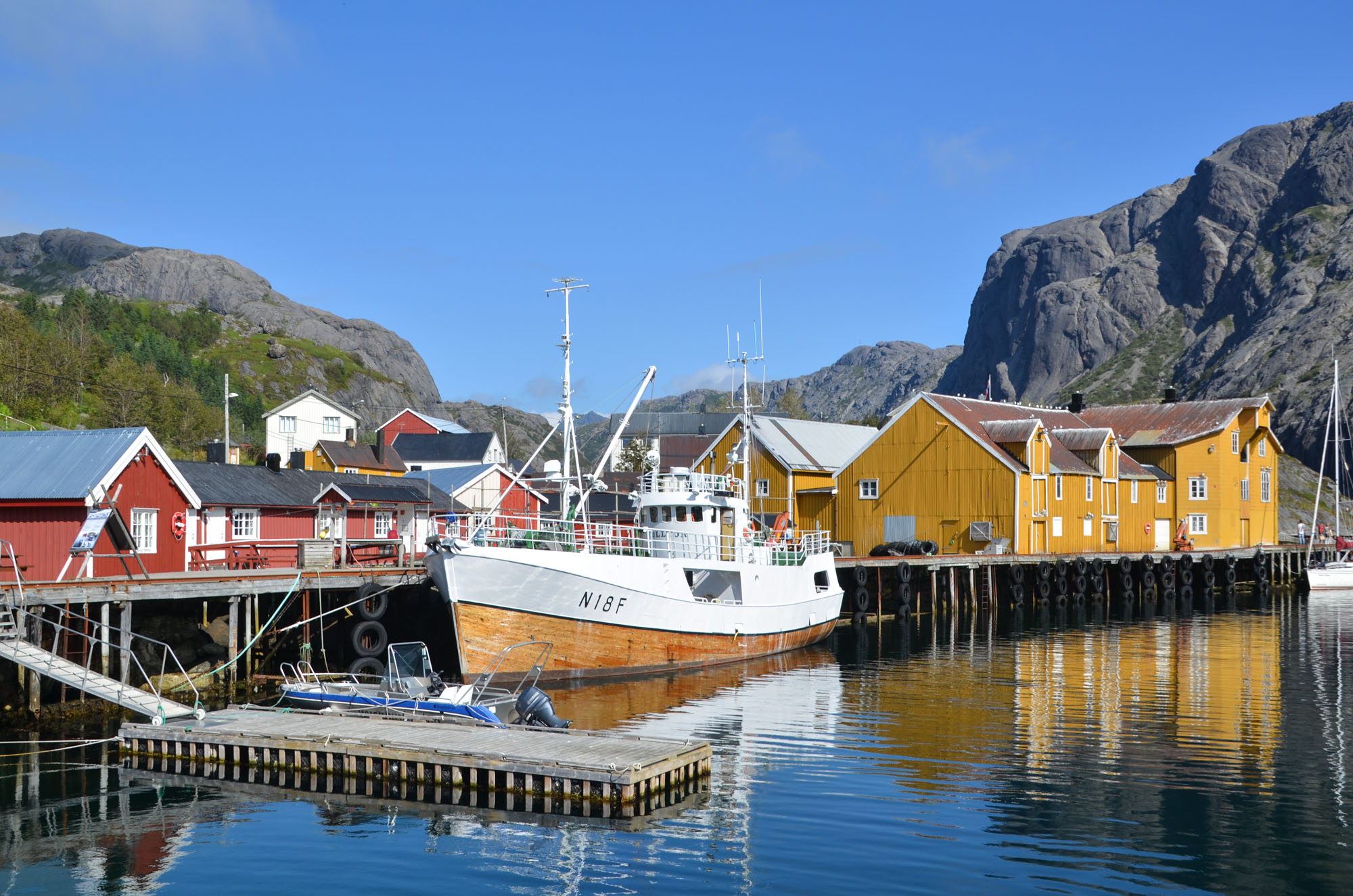
Great post, Ann-Christine. Much to think about. Your boat scene was very restful and the Prague couple are so stylish.
Thank you, that couple really caught my attention! The boat scene seems to be popular too! Hope you are ok down there!
Going well, Ann Christine. Spring has really fired up.
♥
You opened with a stunning rose photo and closed with an impressive wish for freedom. Everything in between was beautiful, too. Well done!
Thank you for your beautiful comment, Egidio!
Profound words and thoughtful reminders to end your post. Yes, we are all deserving of freedom.
Your Swedish summer looks breathtaking and fingers crossed that will be your view next year. It seems as though many people had cold and grey this year, on our east coast as well. The Prague couple was a fun find, and they seem to be made for each other. And church? Where my son-in-law is a paster, their motto is ”come as you are” they would fit right in. lol
All your photos absolutely engaging, and I found the red wedding dresses quote entertaining as out country could be try to find out ”what that means”. A pleasure to scroll through and read, AC.
Glad you liked it, Donna! Hope you are still having a great time – and that it has stopped raining!
Always a great time. The rain just changes the agenda a bit.
🙂
Dear Leya
what an extraordinary beautifully done presentation of the prime colours. We are impressed 👍👍
By the way, we love shades of grey with white. So is the room I am writing in just now. The only prismatic colour in here is a big yellow carpet.
Thank you very much for your great post
Klausbernd 🙂
Thank you very much for your great comment!
😚
I love the dotty rooms, fabulous photos! And the brides in red dresses, the one in the rain with her sensible boots on is a great photo. As for me I am autumn colours : olive, russet, ochre, brown, black, grey, but blue is my favourite colour and I have been known to wear red. Never yellow.
I am glad you liked my choices! And, never yellow goes for me as well . I have had a red skirt and red shoes…Autumn colours are the best! When I think about it, I never wear pink either.
About the bride in the rain – one of my luckier shots. Up with the camera and fast down again. A Shanghai night.
Oh these are wonderful! That couple in Prague – I would never dream of dressing like that but what a great photo they make! And I love your red rose with raindrops, the blueness of that winter geyser shot and so many more. I was also interested in your comment about preferring the secondary colours and I realised that I do that too, to some extent, as purples and greens are my favourites 🙂
Glad you enjoyed these, Sarah! That couple certainly caught my eye…and I would have loved to see their wardrobes. ..!
So we have the same colour preferences! I think for me, yellow is the colour I never could wear.
I can’t wear yellow either, nor orange – they really drain my all ready pale complexion and make me look ill!
That is what they do, yes. Trousers is ok!
Your primary colors are fantastic.
Thank you! A beautiful theme for all of us.
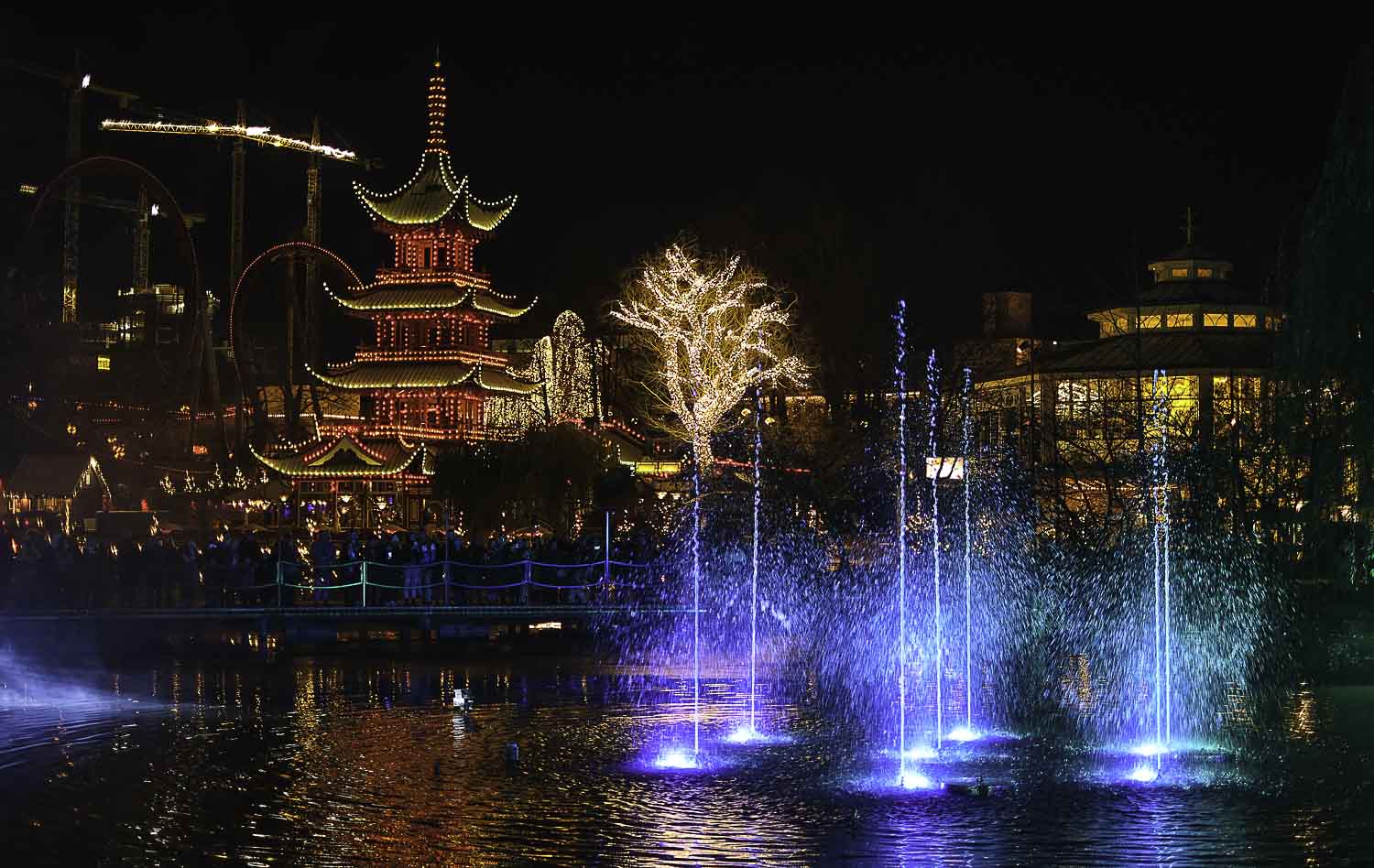
I did the same as Jo. You do blue hour so well. Across the water is just so good. Just love it 🤗
Thank you, Brian, for always positive feedback!
👍🤗
This is done in true artistry – and your approach and choices for the theme made me smile. Cheers to your efforts, Ann-Christine!
Thank uou so much, Frank, this was a challenge for me! And for many others!
Oh, dear- the unhappy bride! And that colourful couple- why don’t I dress like that? I ooh’d and aah’d all through these, Ann-Christine, then I went back and did it again. A favourite? Perhaps the fairy tale scene over the water, but I love all of them, and your lovely, gentle approach to life.
Thank you so much, dear Jo, and I can absolutely see you in those clothes…🤣
🤣💛
These are lovely – you’ve picked some vibrantly successful reds and yellows, but I think you may be most comfortable with blue: I particularly like your first ‘bluey’.
Thank you, Margaret. This was a fun challenge !
I thought so.
A beautiful collection Ann-Christine. I loved your scene of a perfect day. That one belongs on a wall ♥️
Thank you so much, Tina. I still don’t have anything done by myself on my walls… I recall you don’t hang many of yours either? Somehow I cannot see them on my own wall. I know Vivi, for example, ha got several of hers in her flat.
Great selections for the theme – I love the rose and the yellow trees
Thank you, Nora!
So bright! It is full of joy
Thank you – much needed!
such good photo of the ”primary”colors. I loved the bride in that fabulous red dress.
Thank you, Anne, the happy bride or the sad one?
Hope you are ok!
I think she looked happy. I am well.thank you😀
Love that last image! A unique style, indeed.
Thank you!
Pingback: Lens-Artists Challenge #…Primary Colours - Fotofeed