Contrast is what makes photography interesting.
– Conrad Hall
This week Amy challenges us to show contrasts – please visit her inspirational site for more ideas!
My post was mostly made from our Alaska cruise, but a couple of images are from Prague. The first thing that comes to mind is black and white, here illustrated by the hanging man in Prague (…to me B&W also is connected to horror movies) and scyscrapers in Seattle.


Next up are some contrasting colours, black and white, blue and orange.
Over to Frank Gehry’s building and the Monorail built for the World Exhibition in 1962. Interesting to see it pass ”into” the building.

This is totally another kind of contrast. Architecture is fascinating, with contrasts and juxtapositions making us see, hate or appreciate.

On the road side of the same building the contrasts are in both colours, shapes and structures. The natural world/advanced architecture.


A collection of colours, silhouettes and textures. Close/sharp – faraway/blurred. Smooth water contrasting harsh cliffs – and framed/unframed is another contrast.

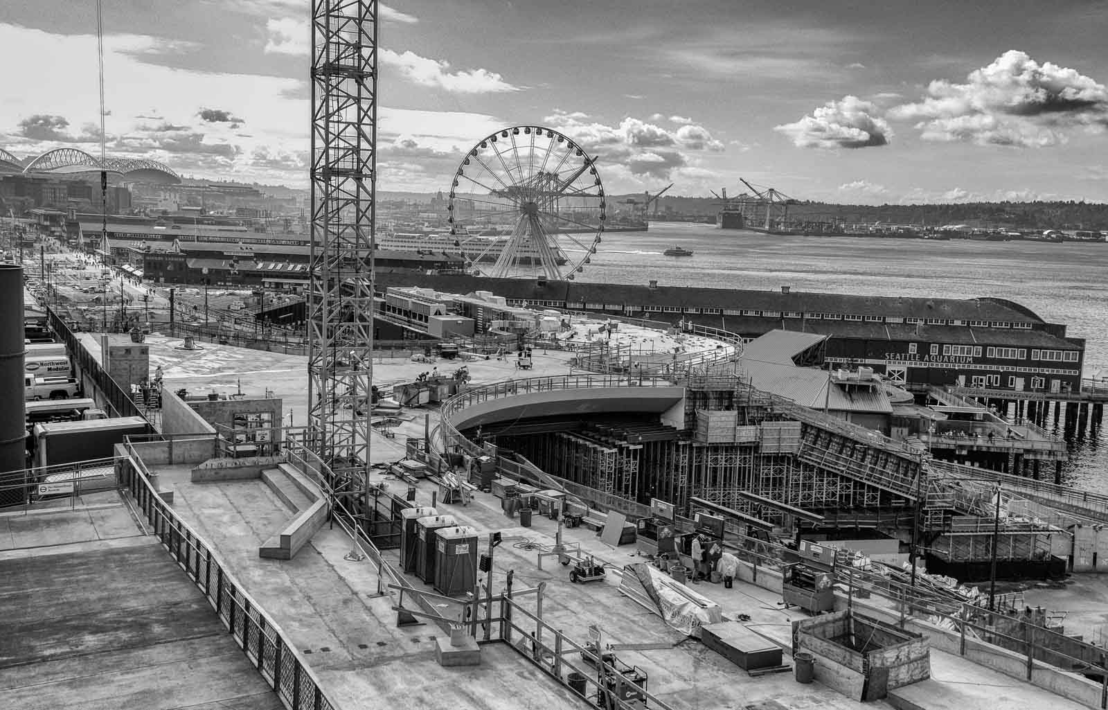
Finally, a before/after – colour/monochrome from Seattle harbour and seafront.

Wow, impressive examples for us to learn from. I agree, B&W is great for horror photos. I’m drawn to your leading lines in the tunnel photo, which is so stunning and combines both color and B&W in one image. It was extra special to see the people walking in the scene as well. The Seattle harbour and seafront in both color and B&W too brought the lessons into clarity. Well done!
Thank you, Shelley, glad you enjoyed it!
I like your opening, although that hanging man feels a little creepy 😁 I like your second photo the most. The light, colors and depth together create an interesting picture with many exciting details. The last one, before and after, is also very good. There the importance of the colors becomes apparent when compared to the black and white.
Thank you very much, Anita – glad you enjoyed them!
The blue and orange photo is amazing, and that red… ”item” in the middle of nature looks so special, is it made of glass?
Thank you, Nicole, the item is Chihuly glass!
Well done, Ann-Christine!!! Wonderful post!
I am glad you liked it, Ana!
This is brilliant, Ann-Christine! Your architecture photos are perfect for this challenge but I also enjoyed your gallery with colours and textures. So beautiful.
Thank you, Sofia. It was a fun challenge, but difficult to choose what to post. I loved going through all the entries – so much variety.
Beautiful collection!
And great examples for this challenge.
I love the Monorail shot!
Thank you, Philo, that was a fun shot!
You are welcome, AC.
So many good images here.
Happy you liked them!
These are all fantastic contrasts!
Thanks, glad you like them, Beth!
Excellent. Love the before/after. 👏
Thanks John!
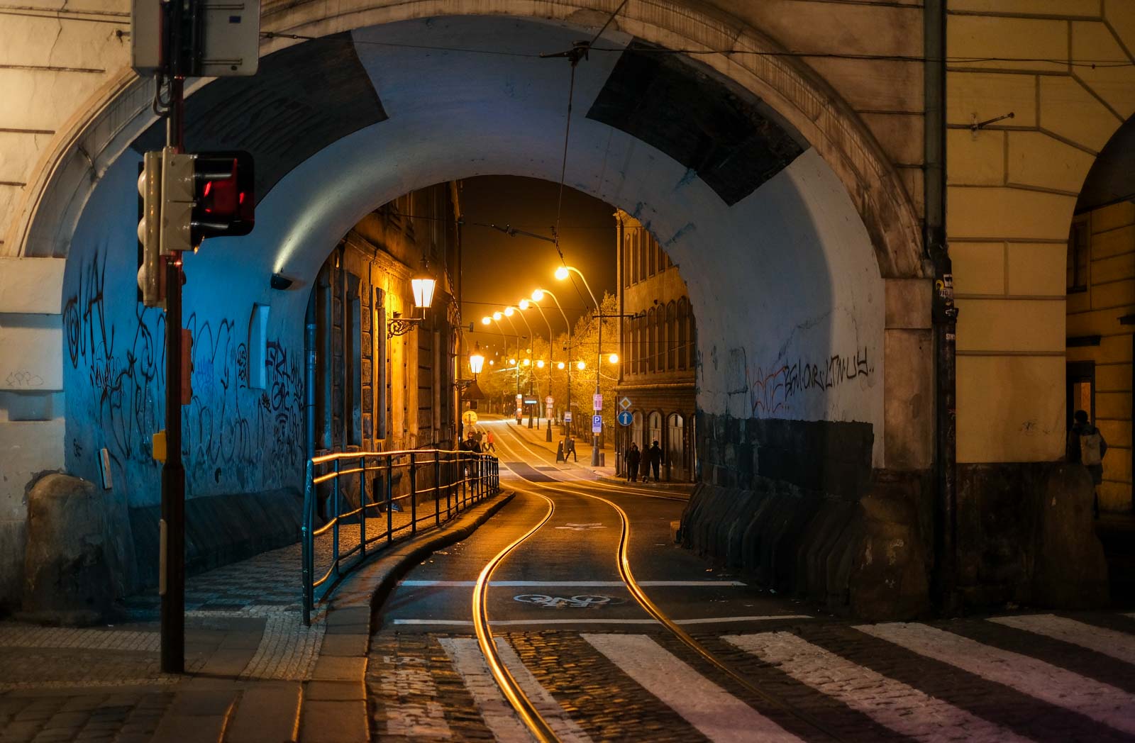
What a lovely set of contrasts. The two views of the Frank Gehry building are lovely. Where is that underpass with the tram line? It’s a wonderful photo.
Thank you, and yes that photo is a favourite of mine. It is from Prague on our way home from a late night walk on Charle’s Bridge.
I especially like the shot with all the colors and the Seattle shot.
Thank you, Janet, they are my favourites too.
Just love the architectural ones . . . it was my childhood dream to become an architect . . . ‘sadly’, post WWII, my parents did not think that practical . . . so off to medical achool I was sent . . . 🙂 !
Thank you, and yes, parents did decide things for you even more in those days!
Great photos of contrasts. I too love the train going into the building 🙂
Strange feeling though…
I think it would be
These are really amazing examples of contrast, Ann-Christine. The third one is certainly wonderful 🙂
Thank you, Hammad, happy you enjoyed them.
I love the interesting architecture you discovered in Seattle. Gotta love the rain. A great idea to show contrast with the drops. Funny to think we spend lots of time running through the rain, when it is so quiet and reflective when we watch it on a window. I loved the image of the color contrasts under the bridge.
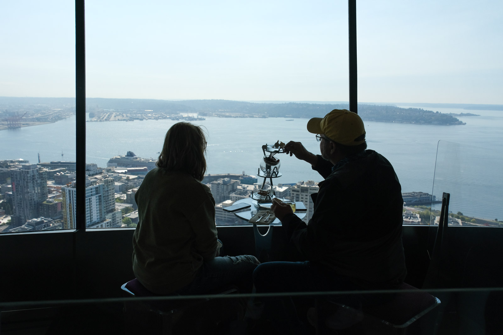
Did you have lunch on the Space Needle?
I am glad you enjoyed them, Donna – but we didn’t have dinner on the Space Needle. Too good weather to sit indoors!
I love your photos of Seattle 😀
Thank you, Cee! It was a nice city after all.
Living only 4 hours away, I’ve been there a couple of times. It’s a fun city, although I would never drive there because the traffic is crazy 😀 😀
OK!
I love what you did with that Seattle Harbor image.
Thank you, Dawn, it came out better than I had expected!
You have amazing photos of the Frank Gehry constructions.
Thank you, Margaret – I didn’t know if I loved it or hated it…
You don’t have to decide!
♥
These are amazing contrasts through your lens, AC! You captured the contrasts of these architecture in Seattle nicely. I also love the second shot, the light and colors are incredibly beautiful.
I am glad you liked them, Amy – thank you!
Amazing contrasts Ann-Christine! My favorite is your second image. I love all the contrasting colors and leading lines that drew me into the picture.
Thank you, Anne!
😊
Very good examples of contrast, Ann-Christine. I hope you enjoyed the Alaska cruise. The raindrops on the window photo is such an evocative view.
Some amazing contrasts of so many kinds Ann-Christine! I thought the Seattle image was especially effective. Also loved the train going into the building. What a fantastic world tour you’ve given us today!
Thank you, Tina! I couldn’t believe that train…