Egidio works with colours this week – please visit his colourful site for more inspiration!
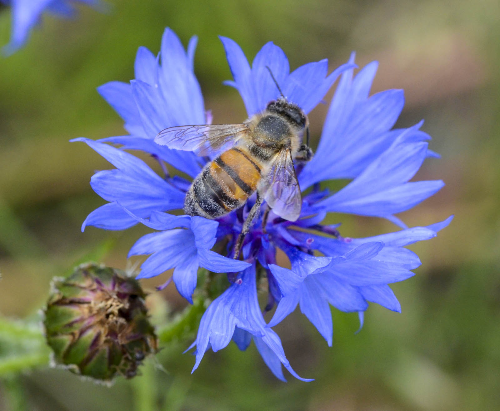
Complementary colors are those that sit opposite each other on the colour wheel. Using them in your photography or painting creates the best colour contrast, and your images will pop. For example, red and green, magenta and green, yellow and violet, orange and blue, and so on. And just like the color wheel transitions from one shade to another, you can use nearly opposite colors to make your images stand out. Naturally, the best results will be with the exact opposites.
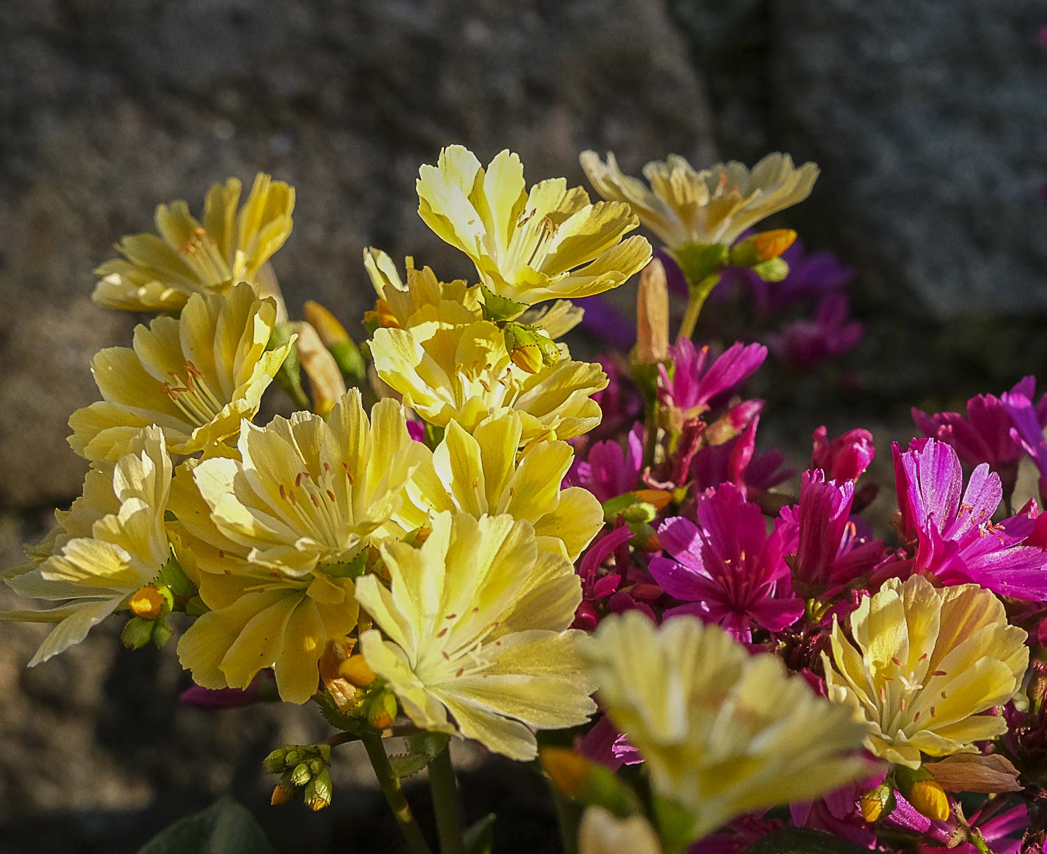
Soft colours pop in their own soft way…
– and strong colours don’t need any further presentation. Then there is red and green, where red is THE chosen colour of Swedish old houses, farms and cottages –

– naturally with a different hue and intensity than in flowers. Green is not the most natural combination with red in our houses though, it is white.

Do you have favourite combos? I guess I have yellow and violet – especially as we can find those two in one single flower – melampyrum nemorosum – the Night and Day flower. When I saw her for the first time, in 1973, it was immediate love. Surely a Swedish, modest wild flower could not look like that? Ever since then she holds an honourable place in my Midsummer bouquet.
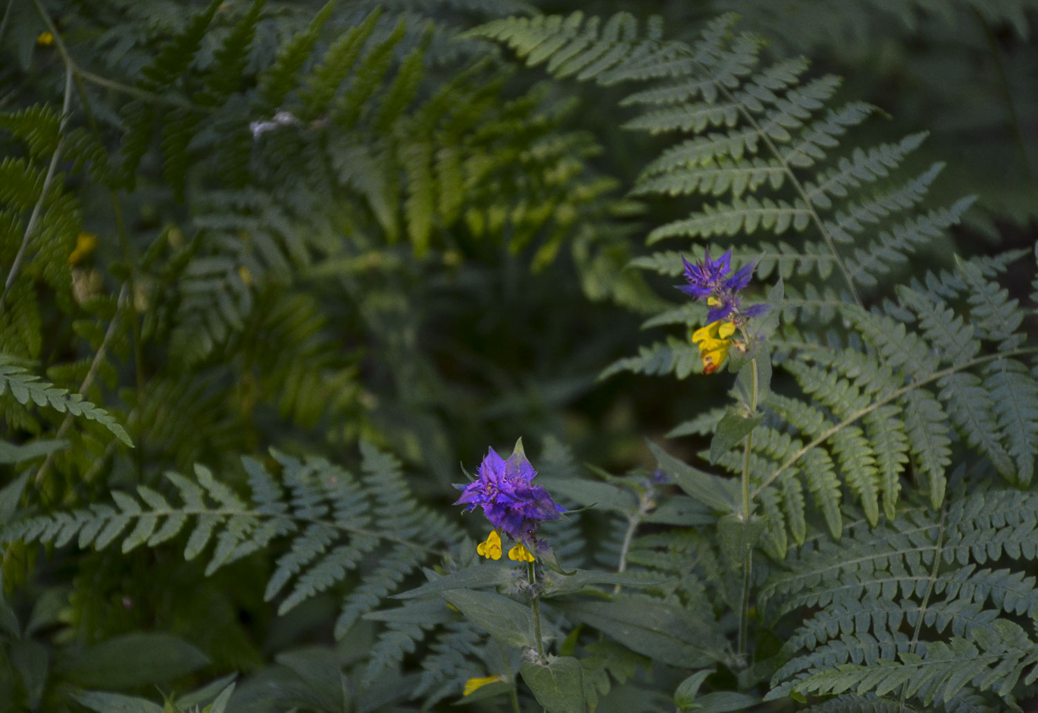
She often stands in the forest, in shadowy places but close to the sea. So I cannot find her in my own forest, only close to our summer house. A truly shy beauty.


These colours look great in abstracts as well as in carnival outfits. They simply cry out: SEE ME, here I am!

Walking home late, the sky above this beautiful boardwalk in Nice kept flashing its carnival colours hroughout the night.

Finally, I guess you know I love poppies! Meconopsis betonicifolia – the blue mountain poppy – is an old love of mine…but, I don’t have it in my own garden as I don’t think I will manage it. It is very expensive and fragile, so I would hate to see it die.
Last week, Ritva got us to shoot from above. I enjoyed it very much – just as I believe you did. There were so many interesting posts!
This week, Egidio asks us to share images with complementary colors that create interest and make your photos stand out. Don’t forget to use the “lens-artists” hashtag when creating your post so we can easily find it in the Reader. Looking forward to seeing you here!
Next week, Tina returns with her first new challenge for the year. It will go live at noon EST in the USA. Tune in to find out another exciting challenge. Please see this page to learn more about the Lens-Artists Challenge and its history.

Beauty
Beautiful, Ann-Christine. Your flowers are such an inspiration 🙂 The Night and Day flower is my favourite this week.
I am glad you liked that little one, Sofia. They are not very common!
Ann-Christine, your photographs never disappoint. Complimentary colours on the house were delightful and so were the rest of the gallery.
Thank you so much, Sheetal! That house seems to be a winner!
Gorgeous shots!
Thank you so much!
Beautiful photos to show off these complementary colours Ann-Christine! Your flower photos in particular are gorgeous and the colours of that Night and Day flower are just amazing! I love it too 🙂
Thank you, Sarah. I often post too many flowers, but they help me feel better😊
You can’t have, or share, too many flowers 🌸💮🌸
🥰
Love that old Swedish house, and the blue mountain poppy against te yellow ones!
That house seems popular!
doesn’t it!
Wonderful examples!!! Great post.
Thank you, Ana!
Egidio’s work with colors sounds incredibly inspiring! I love how complementary colors can create such striking contrasts. It’s amazing how color theory can elevate any visual project. If you’re looking for more creative inspiration and ideas, feel free to check out my site at [Nulls Brawl APK Indir](https://nullsbrawl-apkindir.com.tr/). Let’s keep sharing and inspiring each other!
Thank you! Inspiring!
Beautiful !
Wow, the blue poppy is stunning, Anne-Christine! All of your examples of complementary colors are gorgeous! Love the red and green house!
Thank you, Terri – that house seems popular!
Love the poppy, I don’t think I’ve seen one that colour before
Glad you like it – that colour is heavenly🩵
That is breathtaking. You don’t always get to see flowers of many colors in the same field.
Only in Holland!
Ann-Christine, I am at a loss for words. The beauty in your photos is amazing. Although I like all the images, there is one in particular that is nature at its best: the little purple and yellow flowers in that see of green. That is sublime!
Thank you for a beautiful comment, Egidio! You know I love flowers😍
Too many favourites. Love the house and the ICM
It seems the house is popular! This little Swedish town is famous for its old wooden houses.
❤️
I love the poppy! Never seen the likes of it before ♡
I only see them in botanical gardens and castle gardens!
These are delightful photos and examples Ann-Christine. I love the woman and the boardwalk scene.
Thank you – an interesting challenge with different possibilities. Glad you liked it!
Methinks I have to surprisingly say ‘Oh my God, no, I am not really comfortable with these colour combinations!’ Most actually ‘irritate’ me tho’ I find the Swedish house special and interesting already for its architecture! Looking at my homes as well as the rest of my life – black, grey, all the beiges in the world and lots of plain white with soft touches in oranges and greens always seem to have been there . . , without any thought from me . . . they just feel ‘comfortable’ 🙂 !
🥰
As always Ann-Christine an amazing post. I so loved that Swedish house! One would never see those colors in the US, at least not in the places I’ve been! And of course your flowers are wonderful – most of which I’d never seen or heard. And finally the carnival outfits – OF COURSE!! They’re perfect for the challenge. Well done from start to finish.
Thank you, Tina! A fun theme too.
Love the house… but tulips reminds me that Spring is on the way
Oh, that lovely wildflower (melampyrum nemorosum)! I’m reminded of a favorite flower from my youth, Shooting star, (Dodecatheon meadia). It is delicate and bright, and brightens shady spots. I haven’t been able to cultivate it however.
Thank you, I will have to look it up!
Oh, I know that flower! I bought a plant last summer, so we will se if it is still alive! It is really a gem in any garden. Modest but colourful. Looking closely at it, it’s a wonder!
Pingback: Lens-Artists Challenge – Complementary Colours - Fotofeed
Pingback: Lens-Artists Challenge – Complementary Colours - Bloggfeed