Hosted by Snow and Amanda from Something to Ponder About, on alternating weeks! Why don’t you join in the fun!
Hosted by Snow and Amanda from Something to Ponder About, on alternating weeks! Why don’t you join in the fun!
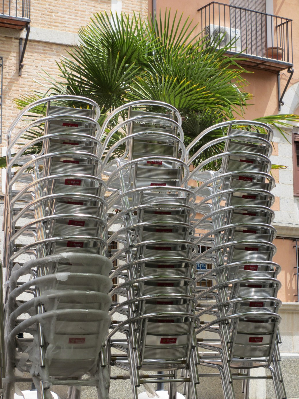
For Frank this week – Nights in Copenhagen and Madrid. Miss them…The header from Madrid is one of my absolute favorite night shots. Maybe because of the lovely memories with my students there, the Flamenco dancers in Villa Rosa, and the glass of fruity red wine while watching the electric flamenco.

Patti’s challenge this week is all about Street Art – something I believe people in general have a special relation to. She shows us some remarkable examples of fine Street Art and asks us to send some more…so, here we go. Greetings from Poland, Sweden and Ireland.
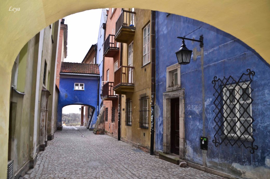
In the header – This happy party I found in a small alley in Lodz, Poland.

Light Move Festival – Lodz

Poster – Canadian artists from famous Cirque du Soleil visiting Sweden

Mural – Blending in nicely in Lodz
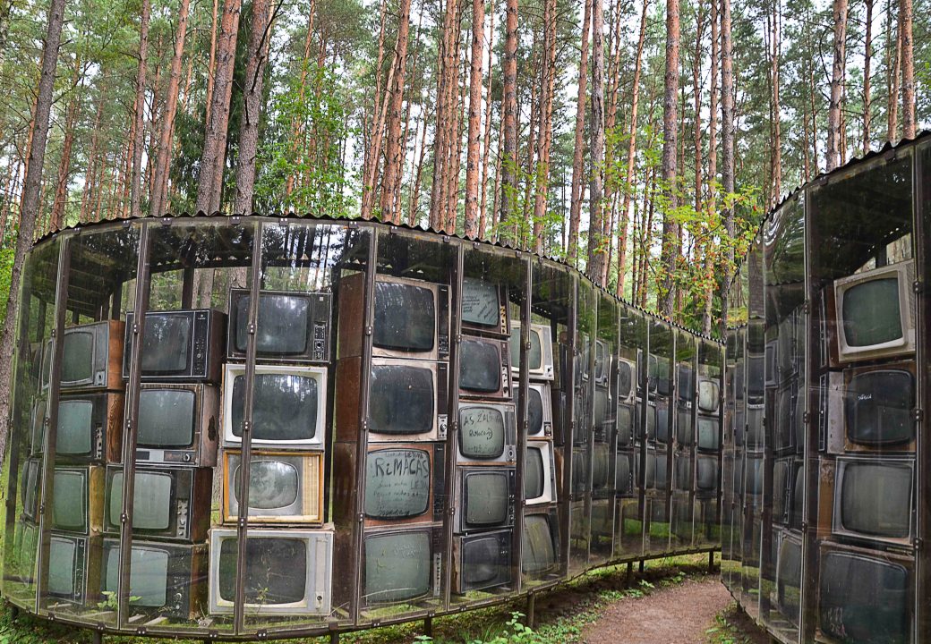
Installation – Poland
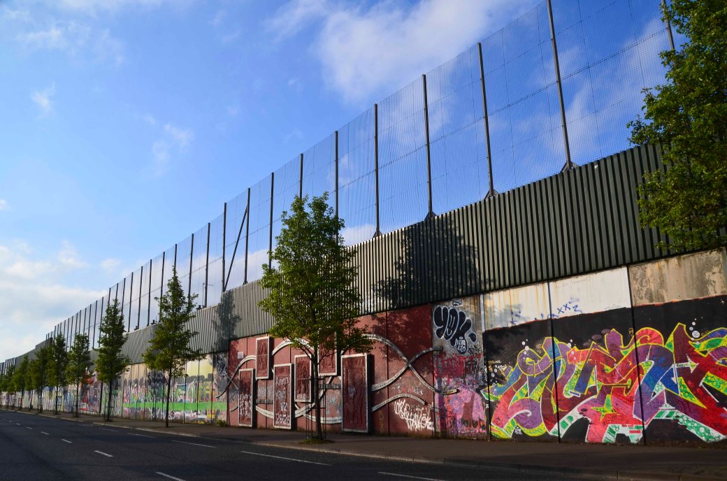
Graffiti: Peace Wall – Ireland
Welcome to join in!
Next week…
…I will be your host! Ann-Christine, Challenge #46. Wishing you an inspirational week and hope to see you then!
This photo challenge is alternately hosted each Friday by the bloggers:
Something to Ponder About and The Snow Melts Somewhere
Amanda’s prompt for this Friday is: Alleys
I have chosen some colourful favorites from Poland, Spain and Morocko.
We dined in here somewhere…
Just walked through, enjoying the softly coloured, calm atmosphere…
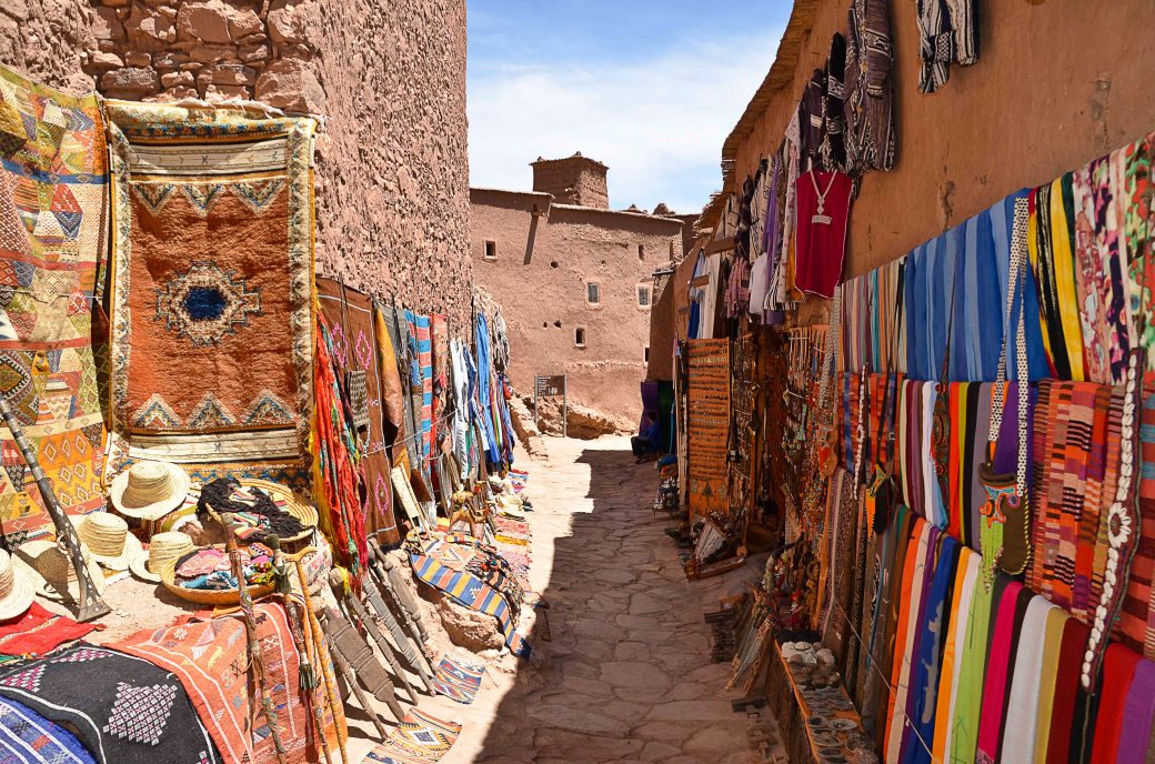
I remember this very hot day and the sweltering walk between these clay walls – No sane people out in this heat…
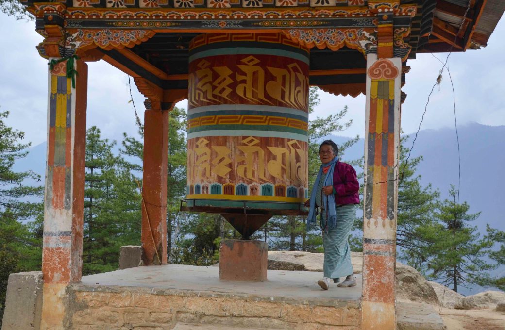
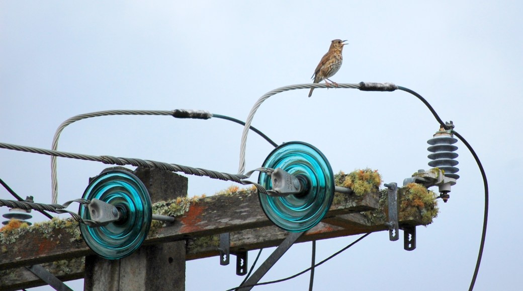
Tuesday Photo Challenge – Wheel
For this week’s challenge from Frank, a beauty from Bhutan turning the prayer wheel.
Tina challenges us this week to think Harmony – and in her splendid post, she encourages us to show our favorite harmonies. In short, Colour Harmonies are colors that look good together. If you have ever taken classes in painting, you should be familiar with the colour wheel. There are many different systems to create a color harmony. You will find a useful, free tool, for colour harmony here.
I guess colours are always a part of what makes up our inner concept of ”Harmony”, but there are also other types of harmonies. These are some of my favorites.
Art is a harmony parallel with nature – Paul Cezanne
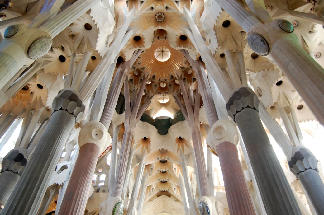
Antoni Gaudí’s masterpiece Sagrada Família.
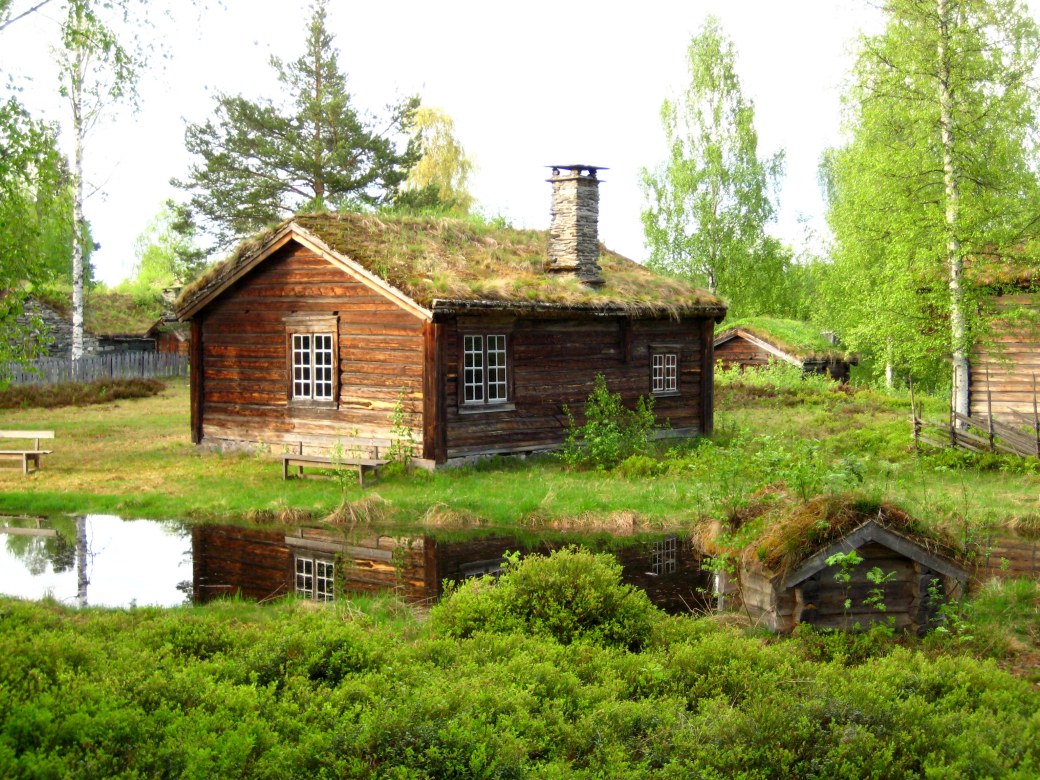
Organic architecture is a philosophy of architecture which promotes harmony between human habitation and the natural world. The term ”organic architecture” was coined by Frank Lloyd Wright (1867–1959), and Wright’s ”Fallingwater” is a very good example – but the concept can also be illustrated with an old Nordic cottage like this one.
He who lives in harmony with himself lives in harmony with the Universe
– Marcus Aurelius


A life in harmony with nature, the love of truth and virtue, will purge the eyes to understanding her text – Ralph Waldo Emerson
Happiness is when what you think, what you say, and what you do are in harmony – Mahatma Gandhi
Harmony is pure love, for love is a concerto ~ Lope de Vega
Even if some will always be playing out of tune…

…it still is a Concerto.

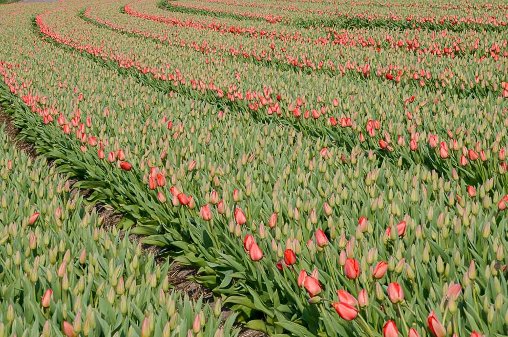
With love from the vast tulip fields in The Netherlands.
So, How do you reach colour harmony in your picture if it isn’t there from the start?
A simple and effective way to change its mood is to shift the white balance either towards the warmer or colder temperatures. This can often also push the image towards a colour harmony. One of the simplest yet also most effective ways to further tune your colour harmony is to use the Hue, Saturation, and Luminosity (HSL) panel in Lightroom.
Or, if you were a certain fashion icon: Women think of all colors except the absence of color. I have said that black has it all. White too. Their beauty is absolute. It is the perfect harmony.
―
Thank you to Amy for last week’s lovely ”Less is More” and we’d love you to join in with Tina’s ”Harmony”!
For Friendly Friday I would like to present the country of Herons – The Netherlands. It seems every garden has its own heron… But Holland is a country claimed from the sea, and sea birds are everywhere in the canals and on the fields.

Herons have got, in every position, style and poise – a certain dignity.
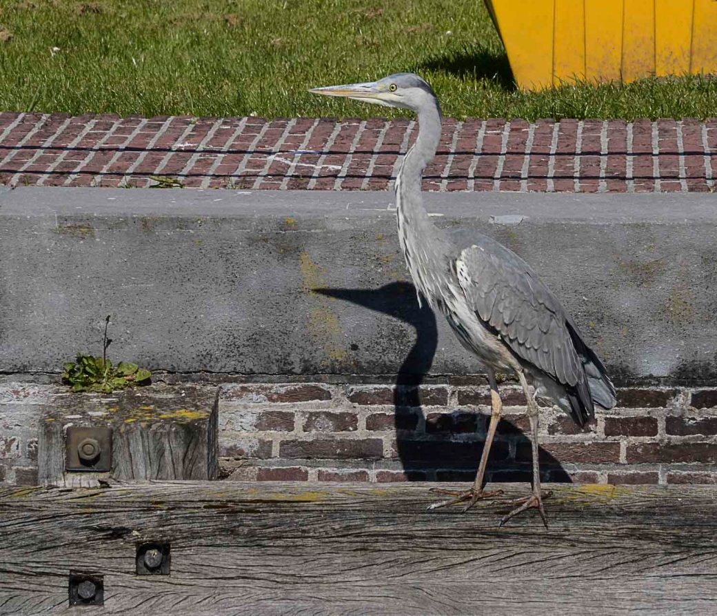
And, they easily let themselves be photographed – as they stand completely still when focusing on their prey. Or study you and your camera.
Amy challenges us to think Less is More – and that, is always a challenge… In photography we often talk about simplicity, and a photo standing on its own. No need for words. Often Black and White is helping us to achieve that.

So, let us slow down…because “Life is really simple but we insist on making it complicated.” – Confucius

Less is More even when the ground is covered in spring flowers below a blue sky,

or when a lonely path strives to reach the mountain lake – because colours matter here –

The history of the phrase Less is More, is that it was adopted in 1947 by architect Ludwig Mies van der Rohem. Since then, the aphorism is one of the most used (and abused) in design and architecture.

Originally though, this is a 19th century proverbial phrase, first found in print in Andrea del Sarto, 1855, a poem by Robert Browning. And it still is a phrase very much alive!

“Simplicity is the ultimate sophistication.” – Leonardo da Vinci
Thank you for all your innovative and creative contributions to my hosted challenge Creativity last week!
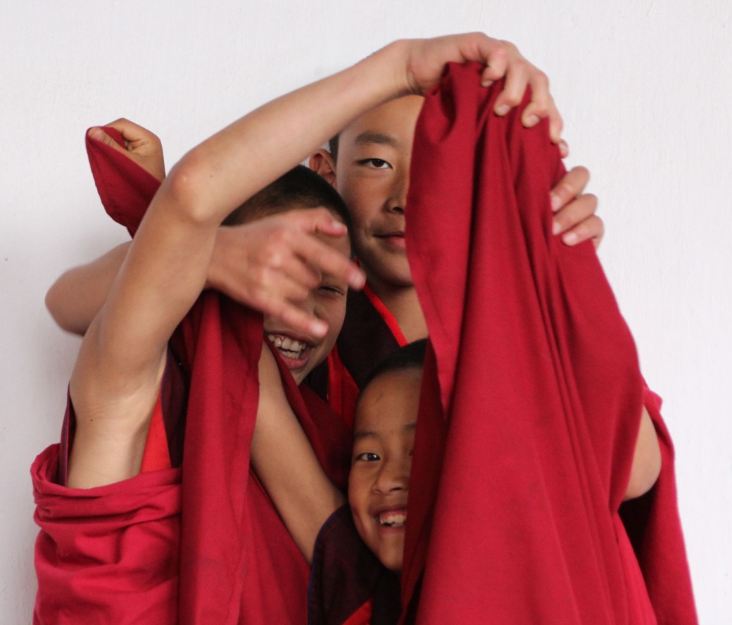
Amanda, at ”Something to Ponder About”, asks us for the Friendly Friday Challenge to look up! When visiting my daughter in Umeå this winter, she made me look up to see this tiny Wolkswagen bubble hanging from the ceiling. Frankly, I loved it.

So, you had better be looking up in order not to miss those funny things!

Du måste vara inloggad för att kunna skicka en kommentar.