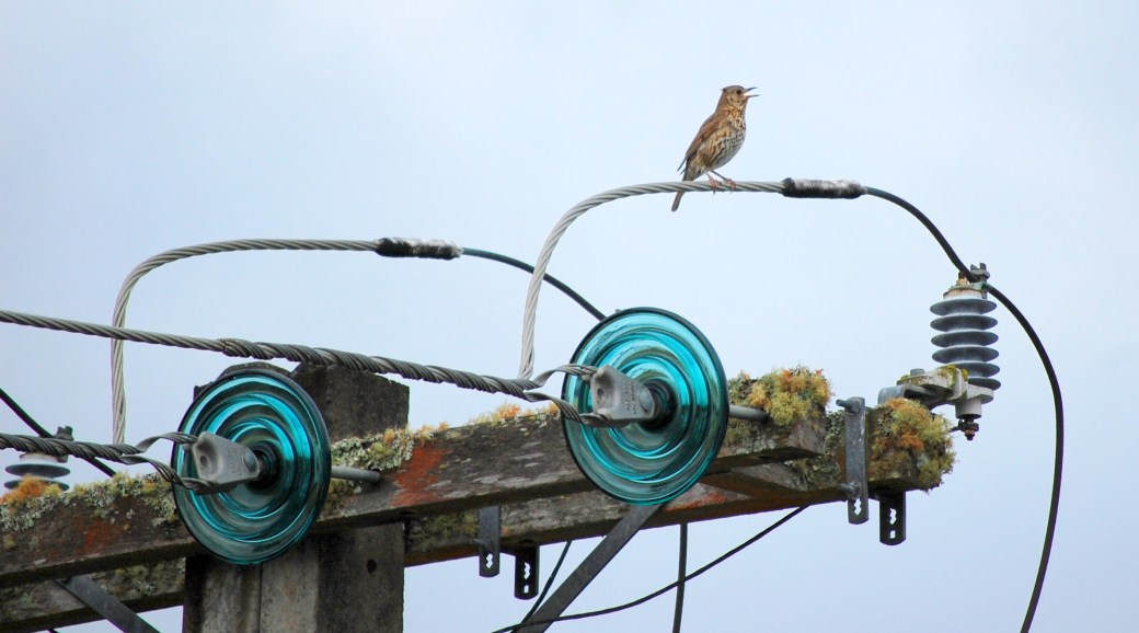
Lens-Artists Challenge # 44 – Harmony

Tina challenges us this week to think Harmony – and in her splendid post, she encourages us to show our favorite harmonies. In short, Colour Harmonies are colors that look good together. If you have ever taken classes in painting, you should be familiar with the colour wheel. There are many different systems to create a color harmony. You will find a useful, free tool, for colour harmony here.

I guess colours are always a part of what makes up our inner concept of ”Harmony”, but there are also other types of harmonies. These are some of my favorites.

Art is a harmony parallel with nature – Paul Cezanne
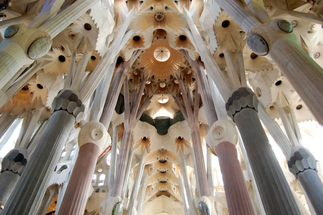
Antoni Gaudí’s masterpiece Sagrada Família.

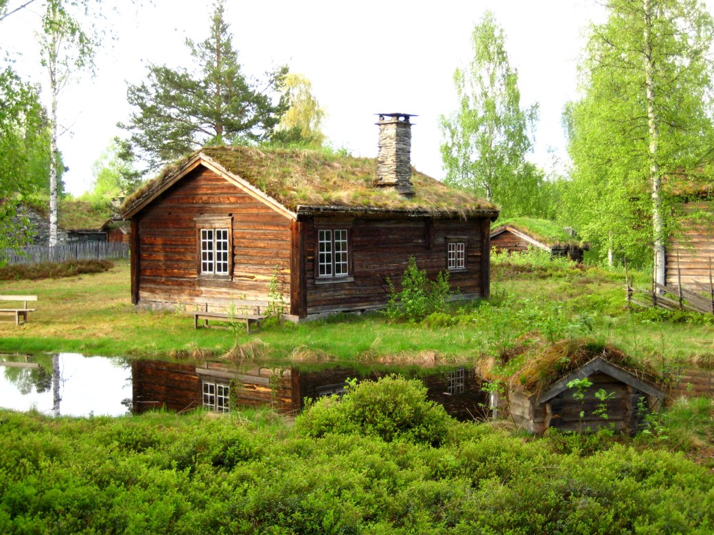
Organic architecture is a philosophy of architecture which promotes harmony between human habitation and the natural world. The term ”organic architecture” was coined by Frank Lloyd Wright (1867–1959), and Wright’s ”Fallingwater” is a very good example – but the concept can also be illustrated with an old Nordic cottage like this one.
 

He who lives in harmony with himself lives in harmony with the Universe

– Marcus Aurelius

A life in harmony with nature, the love of truth and virtue, will purge the eyes to understanding her text –  Ralph Waldo Emerson
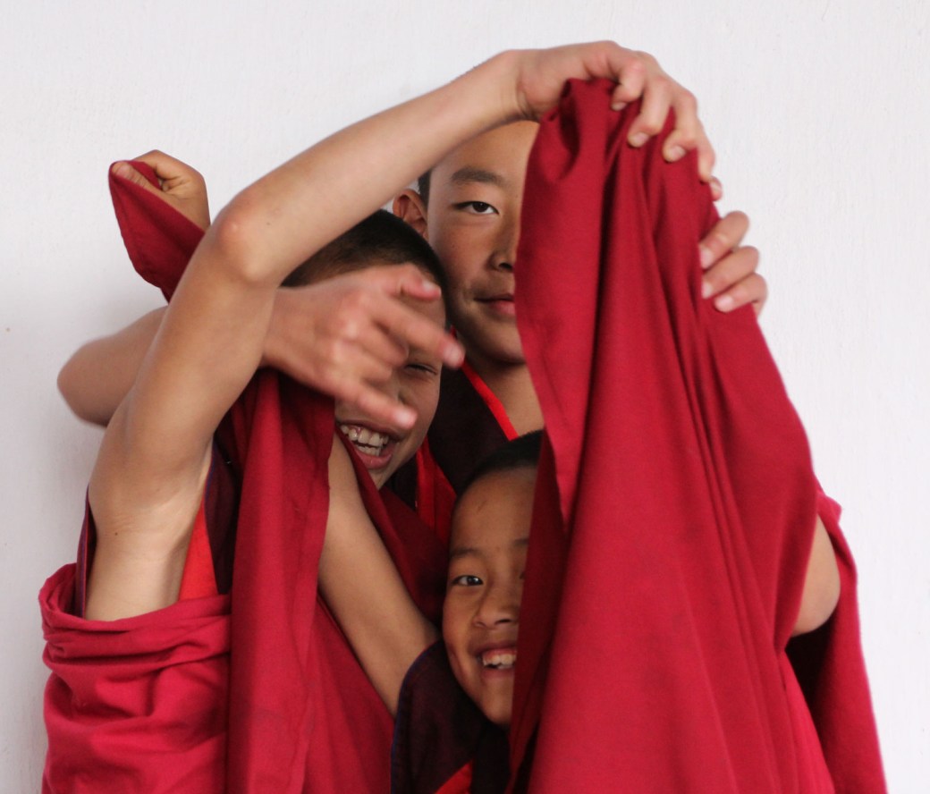
Happiness is when what you think, what you say, and what you do are in harmony – Mahatma Gandhi
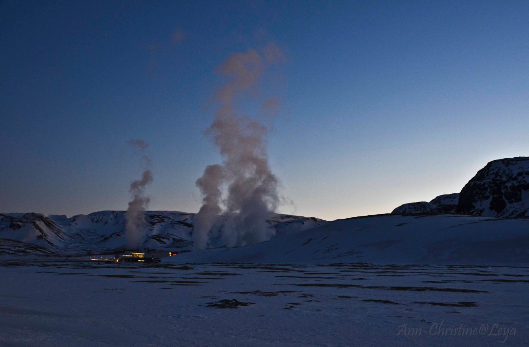
Harmony is pure love, for love is a concerto ~ Lope de Vega
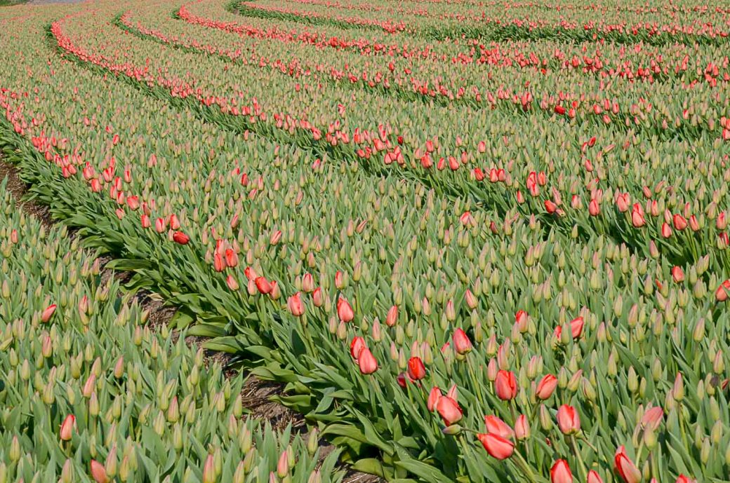
Even if some will always be playing out of tune…

…it still is a Concerto.

With love from the vast tulip fields in The Netherlands.

So, How do you reach colour harmony in your picture if it isn’t there from the start?

A simple and effective way to change its mood is to shift the white balance either towards the warmer or colder temperatures. This can often also push the image towards a colour harmony. One of the simplest yet also most effective ways to further tune your colour harmony is to use the Hue, Saturation, and Luminosity (HSL) panel in Lightroom.

Or, if you were a certain fashion icon: Women think of all colors except the absence of color. I have said that black has it all. White too. Their beauty is absolute. It is the perfect harmony.

― Coco Chanel


Thank you to Amy for last week’s lovely ”Less is More” and we’d love you to join in with Tina’s ”Harmony”!

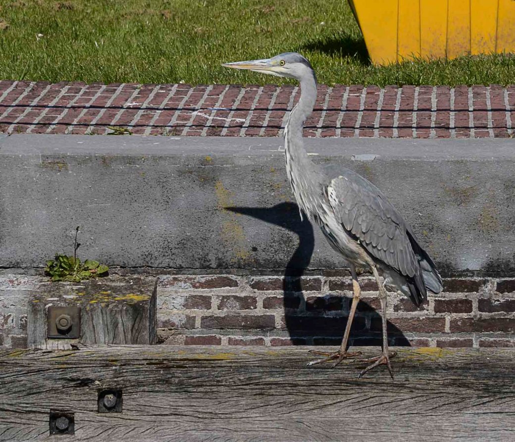
Friendly Friday: Posing

For Friendly Friday I would like to present the country of Herons – The Netherlands. It seems every garden has its own heron… But Holland is a country claimed from the sea, and sea birds are everywhere in the canals and on the fields.

Herons have got, in every position, style and poise – a certain dignity.

And, they easily let themselves be photographed – as they stand completely still when focusing on their prey. Or study you and your camera.


Thursday Thoughts – Exploring the Unknown

As so many of you expressed your appreciation over my son’s inspirational desk (Creativity Challenge #42)…I thought I would invite him this Thursday, to share some of his creative work with us. And he said Yes – so – I hope you will enjoy his explorings!

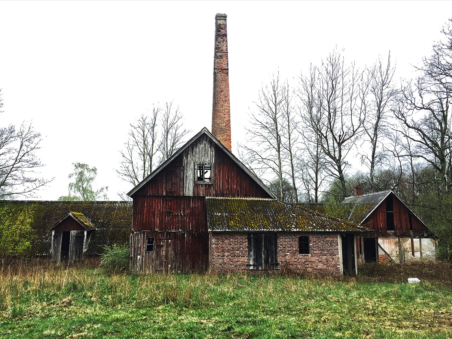
Sösdala Distillery

There lies an old distillery right next to what feels like endless farm fields. One might assume that the farmers grow potatoes, barley or wheat here – since they are all big components in making spirits – especially Vodka.

This distillery, which is considered one of the oldest in Sweden, was built in 1860 – the same year Sweden passed a law against moonshine. At the time, alcohol consumption was becoming a big issue. Some workplaces even offered to pay their workers in home brewed spirits. This law marked an important milestone towards state-regulated spirits, and an overall healthier relationship to alcohol. But on the flipside, it also gave birth to lucrative smuggling from Denmark.

Sadly, the remnants of the production were few. Some barrels could be found, as well as rusted taps and scales. They had some straw beds left, along with a very rusty stove. I’m impressed that the tall chimney is still intact. Though I wonder why they built a square chimney instead of a round one – since the latter is proven to have better airflow.

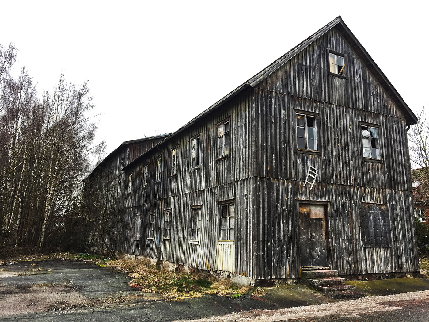
Bjärnum – Mattssons Furniture Factory

A remnant from a time where this little town, located in the southern parts of Sweden, flourished with furniture factories. It was abandoned in 1982 and will soon be demolished to make space for a new housing area. I like to imagine that the craftsmanship within these walls will be decorating households for decades to come – so that even if the factory is no more, their work will live on.

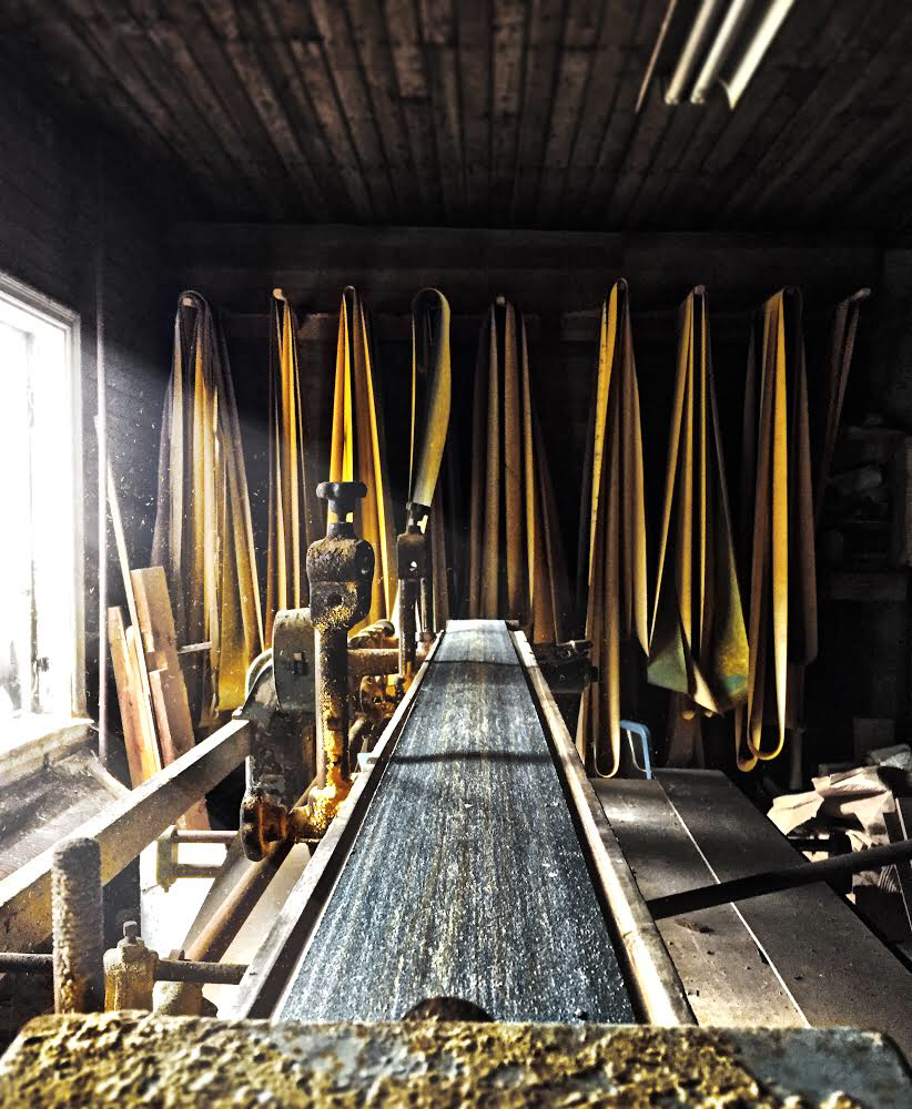
Some of the original machinery is still intact and would probably function if serviced.

The ground floor invokes the feeling of a haunting murder scene due to the red color pigment leaked onto the wooden floor. Every single scratch and mark reveal the countless hours of pacing and activity inside. Scrapings from the wooden joist creating a half moon shape onto the door – which most likely led to a loading area.

Posters and signs can be found throughout the factory. The top one forbids the use of tobacco, while the bottom one is a poster for seminars about ”international issues”. The year is 1933, and the fee for the whole course was 1 Swedish Crown. Today, 2019, that would be 32 Crowns – an interesting way to get a perspective of currency inflation.

The building consists of three whole floors. While the lower ones are filled with machines and tools, the upper floors mostly contain books, almanacs and old photos. Ranging from the 1890s to the 1980s – almost a whole century of history.

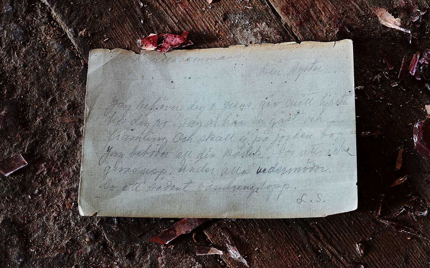
A stack of paper signed ”L.S” is hidden in a desk drawer on the middle floor. Intimate letter correspondence between one of the workers, assumably a seamstress, and her husband who was sent into World War II. We get to invest ourselves in the hardships of past times. The longing hearts of two lovers, separated. Exchanging handwritten words, feelings and prayers.

Urban exploring is an interesting way to experience and learn about history. These places are all forgotten and abandoned. Sometimes they’re just empty shells. I enjoy searching for puzzle pieces, trying to recreate their stories to show the beauty of it all. It’s a way to pay respect to these life stories – and a way for them to be remembered – if only for a short moment in time.


I would like to thank my Mother for this opportunity. This blog is an inspiration for me, and I hope you enjoyed this peek into my thoughts.


Sincerely,

David P


Lens Artists Photo Challenge #43 – Less is More

Amy challenges us to think Less is More – and that, is always a challenge… In photography we often talk about simplicity, and a photo standing on its own. No need for words. Often Black and White is helping us to achieve that.

So, let us slow down…because “Life is really simple but we insist on making it complicated.” – Confucius

Less is More even when the ground is covered in spring flowers below a blue sky,

or when a lonely path strives to reach the mountain lake – because colours matter here –

The history of the phrase Less is More, is that it was adopted in 1947 by architect Ludwig Mies van der Rohem. Since then, the aphorism is one of the most used (and abused) in design and architecture.

Originally though, this is a 19th century proverbial phrase, first found in print in Andrea del Sarto, 1855, a poem by Robert Browning. And it still is a phrase very much alive!

mera-vc3a5r-2012-066-e1556356786995.jpg

“Simplicity is the ultimate sophistication.”   – Leonardo da Vinci


Thank you for all your innovative and creative contributions to my hosted challenge Creativity last week!


Friendly Friday – Looking Up

Amanda, at ”Something to Ponder About”, asks us for the Friendly Friday Challenge to look up! When visiting my daughter in Umeå this winter, she made me look up to see this tiny Wolkswagen bubble hanging from the ceiling. Frankly, I loved it.

So, you had better be looking up in order not to miss those funny things!