Lens-Artists Photo Challenge #96 – Cropping the Shot

Patti challenges us to show how we crop our shots and why. See her own great examples of how to do here.

There is a vast difference between taking a picture and making a photograph.

Robert Heinecken

There are different ways to enhance a photo, and I am quite sure many of us use some kind of software to help deliver the feeling we want to shine through to the viewer. One of the easiest ways to change a photo considerably is by cropping it.

”This week’s challenge is a chance to explore a photo editing technique and the benefits of cropping the shot.  Show us how cropping helped to improve an image and create a desired effect.  Include the shot “before” and “after” so we can see the difference.”


I cannot say I am an avid ”cropper”, but often I do some minor cropping. I am fully aware of the photo losing quality if I crop it too much.

Today I tried to find photos where I could easily show how I think. In the header/opener is a photo from my garden and the magnolia in late evening light. Even if I like that photo, I was not happy about my house showing as a blue ”shadow” in the background. There was also a flare on the upper left hand side. I made a rather tough cropping and the result is only the brightest flower in focus. I still like that first image, but a close-up was my final choice.

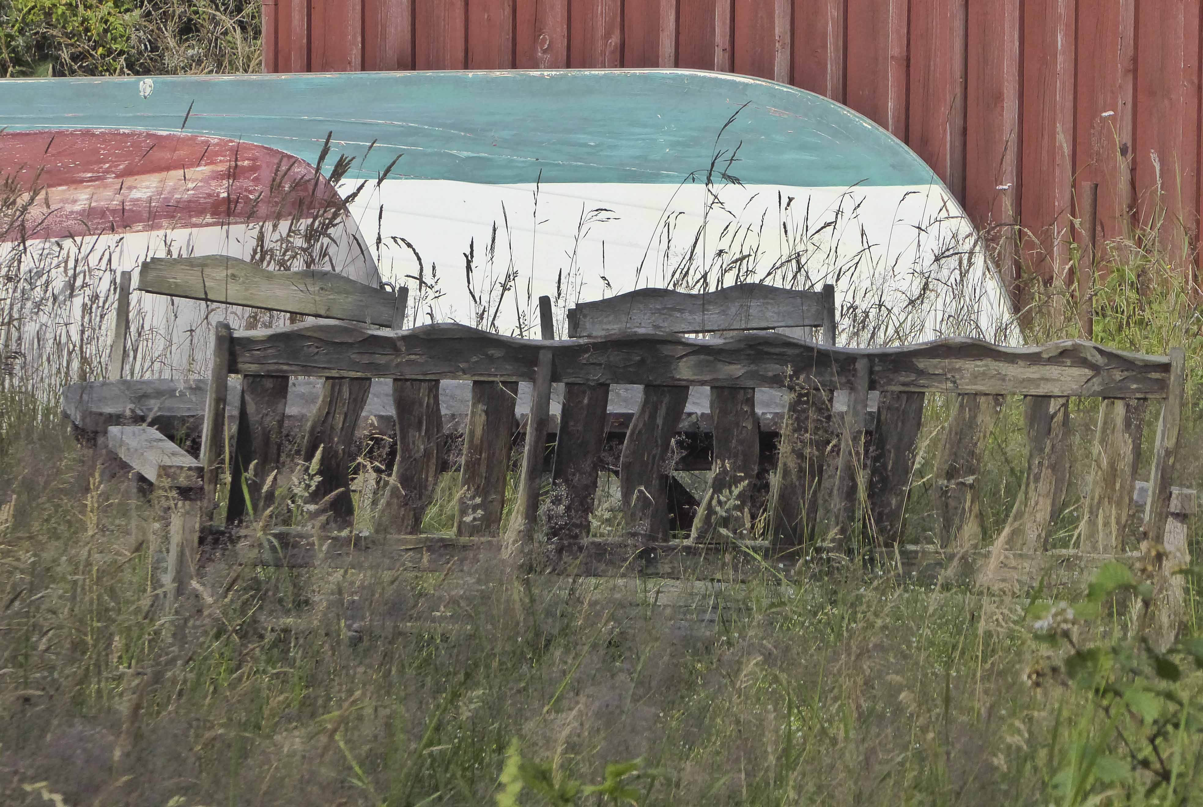
A boat trip in Holland last spring went to an outdoor museum, and this is where we landed. I loved the orange and blue together, but the old factory was the main building,

so I cropped out everything on the right side of the photo. This also made the content more substantial. In the first photo, I found the ”division in two parts” disturbing, even if the skies were much more alive and the photo had a lovely ”painterly” feeling.

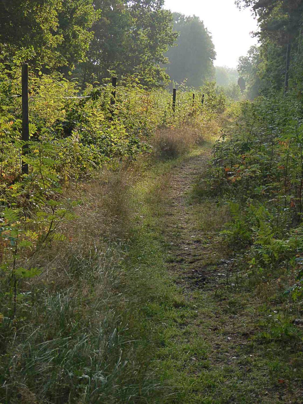
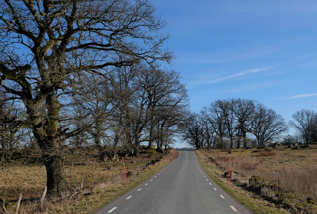
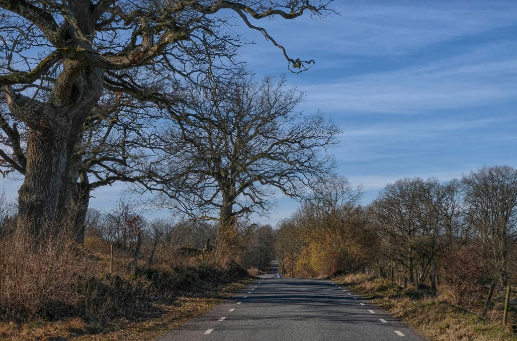
A final example is from a misty morning walk, where the path is a much loved one, but the image is in more harmony when its focus is far away to the upper right.

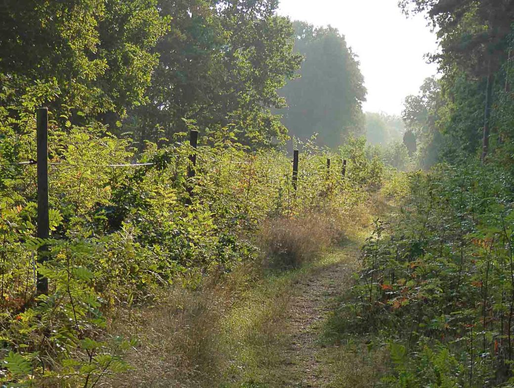
This was my final choice. The light green moving towards a darker nuance, instead of being a dividing part in the middle of the photo with darker green in beginning and end.

All in all, it is a good idea to put yourself the question Why should I crop? Because, there should always be a reason. And you always lose something in order to win something else. The goal is to make the first image the final image, but at least for me, it seldom is. I have noticed one thing though – I should trust my first thought/shot. Often I go back to it again – to find it wasn’t that bad…

Next week, we’re delighted to announce that Sue of Mac’s Girl will be our guest host for Lens-Artists Photo Challenge #97 on Saturday, May 16th.  Please be sure to stop by her site and join the fun.

Lens Artists Photo Challenge #43 – Less is More

Amy challenges us to think Less is More – and that, is always a challenge… In photography we often talk about simplicity, and a photo standing on its own. No need for words. Often Black and White is helping us to achieve that.

So, let us slow down…because “Life is really simple but we insist on making it complicated.” – Confucius

Less is More even when the ground is covered in spring flowers below a blue sky,

or when a lonely path strives to reach the mountain lake – because colours matter here –

The history of the phrase Less is More, is that it was adopted in 1947 by architect Ludwig Mies van der Rohem. Since then, the aphorism is one of the most used (and abused) in design and architecture.

Originally though, this is a 19th century proverbial phrase, first found in print in Andrea del Sarto, 1855, a poem by Robert Browning. And it still is a phrase very much alive!

mera-vc3a5r-2012-066-e1556356786995.jpg

“Simplicity is the ultimate sophistication.”   – Leonardo da Vinci


Thank you for all your innovative and creative contributions to my hosted challenge Creativity last week!


Thursday Thoughts – Trying to Photograph My Dogs…

We set out in the early morning to enjoy the stillness and the bird song – I thought I might get some photos of the two boys together too…Totti hates the camera, but Milo tries to be

…complaisant. Not always succeeding, but, he helped checking out the bird houses …

…even if they were still empty, no guests arrived yet. A couple of weeks more is needed.

When spring arrives, they both need hair cuts often – but still get warm and thirsty.

Some advice from me – never turn your back on your motif…and never try to shoot without warning! Totti and Milo knocked me down and showed their best, wet and friendly approach…A very foggy lens emerged from this attack.

Here they are finally posing, after some hours of digging and running in muddy waters.

Well, which shot did you like best? My first favorite was the one of Milo alone – in the header. But after some hours…maybe the last one. After all, they are my sweeties!

Thursday Thoughts – Oaks and Hazel in All Directions

Have you ever stopped to look at a view from all directions – tried to memorize it and then photographed it? I think it makes me more firmly rooted. In the header – North.

An unknown country road on a sunny February day – no wind. East.

Three sides photographed now – West.

When I walked out in the middle of the road here, I felt I had at least three thoughts, besides how beautiful the oaks were:  I hope there are no cars coming… I wonder when this road lost its gravel? I wonder how many farms were connected by it from the start?  – Now I wonder what your thoughts might be? I love country roads – they hold a special place in my heart, so, how about you?

And finally, South.

How I love the naked winter trees against the blue sky.


Enhancing, Destroying – or Just For Fun?

I have been playing around with Photoshop, and Nik filters. I wanted to show this little island, Tylö, in three different interpretations. In the first picture – in the header – it lies hidden in a haze, seen from the attic window of the hotel building.

In the second one, you see it in a B&W conversion, a bit old style, with only the sea in front and behind …

…and in the last picture, you see the island the way I did through my camera lens.

It is not the same picture, but the same island photographed. I would love to hear your thoughts and reflections: Which interpretation do you prefer? Why? What feeling/mood comes up when you look at one of these pictures?

Do you like to enhance/change your own pictures much before posting, or should they go as true and ”natural” as possible?

Wish you a great weekend!


Picture Critique

For a couple of weeks, Otto von Münchow kindly shares his expertise if you want an opinion about a picture – here is mine. Some suggested changes are not possible, the shot was situational, but the cropping is. So, I have followed his advice, and by comparing the photos you can see the difference it makes. I attended one of Otto’s online courses this summer, where he also stressed the importance of waiting for the right moment. I will have to practice that more… Thank you again, Otto!

Hi Otto! This is a photo taken in a cafe´in Lodz, Poland. I loved the colours and the people there, but how do I make the best of it? Thank you for taking your time and skills for this!

  • Otto von Münchow
    Leya

    This is a fun photo, playing with forms, shapes and colours—both natural as part of the room we look into as well as indirectly and as a juxtaposition in the mural on the wall in the back of the room. I think your framing is enhancing the playfulness in the room. You have a frame with in a frame by looking through a opening between two rooms, and not the least you have included a tiny bit of a red box to the right—probably a piece of furniture—and the blue seat to the lower left. It ends up being a composition with primary colours (from a traditional painters palette and not the additive primary colours), respectively yellow, blue and red. In contrast to all these geometric shapes, we have the organic forms of the people sitting in what is obviously a café. In fact, there is a hint of a fourth person around the column to the right. I like the smiling expression of the face of the woman obviously in conversation with this fourth person. It’s a little pity that the woman behind her, all the way towards the rear wall, is in her face, so to speak. Some separation between the faces would have made both of them stand out more clearly. You could have accomplished this by moving to the left, but then you would have left the bit of red furniture to the right out of the frame. The best thing would have been to await the situation, wait until the two faces had moved away from each other (but then of course you might have lost the smiling expression I mentioned before). One more detail: I think I would crop off a little bit of the yellow support in the upper part of the photo. Give it a try, at least this is easy to accomplish. In the end this is another captivating photograph.

Perspective – 1, 2 or 3?

What perspective do you use – for the most part – when you shoot your photos?

I like the total difference it makes to the picture – depending on what you focus on.

These three pictures were taken from the same spot – but I try to communicate three different ”feelings”. Simple, but interesting. Of course we decide according to what we want to say…but I know we all have our preferences…

…so what is yours? Why?

Travel theme: Self

Ailsa’s theme this week gives you another chance to reflect on who you really are. What is the very essence of you? Not easily done in only one picture…so I had to choose two.

The loner, hiking in nature – but I am also the photographer and the lover of my job and my students. The results are one picture from a hike at Svartisen, Norway, and the other taken by a student at the final dinner for my class, leaving school, heading out in Life.

Why not take the chance to figure out the very essence of You? Click here for more inspiration.